When you open your favorite presentation software, you've got a ton of choices to make. That includes choosing the best presentation colors. What are the best presentation color palette options, and why?

Whether you use Keynote, PowerPoint, or Google Slides, this tutorial is sure to benefit you. You'll see the best presentation color palettes for every occasion. You'll also see templates that include the best color palette presentation designs. Let's get colorful!
Color Theory: What You Need to Know
To speak the language of color, it helps to know the terminology you'll encounter while putting together your palette. Let's look at some standard color terms and how to consider them as you create your presentation.
1. Primary, Secondary, and Tertiary Colors
It might be a bit of review from your grade school days, but to understand color, let's start by reviewing these three key terms:
- Primary colors include red, yellow, and blue.
- Secondary colors are made by mixing equal combinations of primary colors in equal amounts, creating orange, green, and violet.
- Tertiary colors are also a mix of colors, but not in equal amounts. For example, yellow-orange is a mix of yellow and orange. That means it would contain effectively two parts red, and one part yellow.

Also, use the color wheel to help understand how colors fit together. Colors directly across from each other on the wheel can be paired to create schemes called complementary color combinations. That's one example of a principle that helps you create the best presentation color combinations.
2. Tints, Tones, and Hues
While the color wheel shows each of the colors at their "pure" form, we know that there are many other versions of a color. This comes down to aspects like tints, tones, and hues.
Tints of color are created by adding white to the original color. Tones go hand-in-hand with color because they're created by adding grey to the original color. I like to think of tint as how much of the base color is truly represented.
According to Color Wheel Artist, the term "hue" is sometimes misunderstood and used interchangeably with "color." You might hear even a skilled artist refer to a blue hue in place of saying that an object is blue.
So, what's hue? The hue is a specific color's origin. For example, navy is a color with a hue of blue. Chartreuse is a color with a hue of green. This differentiation is helpful while creating presentations.
All these factors influence a color's usability within a presentation. Each color is usable in a presentation, but not in every part of a presentation. Read on to find out more.
How to Experiment With Color Palettes of Your Own
Are you searching for the best presentation colors to use in your next project? Don't make your decision lightly. Color choice is one of the simplest, yet most crucial design decisions that you can make.
Your decision centers around a critical question: what's the best presentation color palette? There's no single answer. You want to find colors that help your content stand out.
This can involve matching slide design elements with your brand's custom colors. Or you might want to include text that mirrors colorful tones found in an image. Either way, you'll need visual tools to do it. That's where Adobe Color comes in.
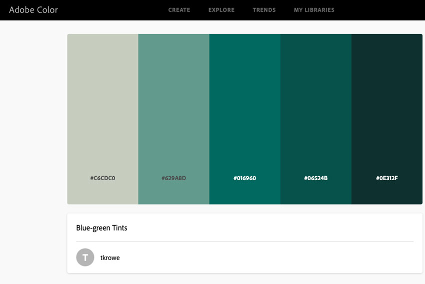
Use Adobe Color to Create the Best Presentation Color Palettes
Adobe Color is a browser-based visual dashboard that lets you experiment with color. In seconds, create color palettes that help your slides shine.
The web app itself features a color wheel and five easy-to-edit panes. These allow you to build out custom schemes.
Custom color palettes may be nearly identical in shade, or perhaps totally different. All they need is the ability to work well together visually. Adobe Color lets you explore different styles. Look at monochromatic, triad, complementary color combinations, and more. Those options are found on the Color Harmony menu on the left side of Adobe Color.

Imagine for a moment that you want your best presentation color palette to be all one color. In that case, use monochromatic color tones. In other words, you feature the same color in many shades. With Adobe Color, build out five shades side-by-side in the color-chooser.
Plus, click and drag within the color wheel to highlight a given section. Down below, you'll see each color block update. It's a great way to see the best background color for presentation use instantly.

For a more exact approach, drag the sliders to change up RGB color mode elements. These help you dial in custom tones and gain the ultimate in creative control.
Your color palette presentation theme might revolve around your branding. In other words, your organization may have a specific set of colors that it always uses on slides.
Adobe Color is ready to accommodate this. Just below each color swatch, input a color hex code. That's the best way to ensure an exact color match.

You can also explore other color modes like CMYK, making it easy to adapt Adobe Color to your project needs. There are even options built in to extract colors right out of image uploads. Transform these into custom palettes, making precise color matches a breeze.
When you jump over to your favorite presentation app, use the color chooser along with the hex codes to use the colors you selected in the tool. It differs by the app, but they all support using hex codes.
How to Choose the Best Presentation Color Palette
So far, you've seen tools and ideas for generating color palettes. You might still be wondering, "Which of these is an effective color scheme?"
Here's the thing: there's no singular option for the best presentation color palette. Every color you can imagine has its place in the world of presentations. The truth is that selecting the best color palette presentation option is all about the content and environment.
I've put together a simple three-pillar approach to selecting the best presentation color palette. Let's dive in:
1. Consider the Content (and the Audience)
The most essential part of creating the best presentation colors is considering the content and the audience. You wouldn't use bright yellow and purple shades to announce layoffs. You also wouldn't use a black and white scheme to announce good news.
So, what colors should you choose?
- For more serious presentations, a monochromatic color scheme works well. It tends to be less distracting from content and works well in business and corporate environments.
- If your favorite color is highly saturated and a bright hue, try to avoid using it as a background. It's harder to read text with an oversaturated background.
- Complementary color schemes are right for a wide variety of presentations and are a good go-to move when you aren't sure what to use.

Remember: there are no colors that are off-limits for a presentation. Instead, it's all about matching your selections to the content so that it supports your presentation.
2. Remember Readability
Above all, selecting colors is an exercise in complementing your content.
Have you ever seen a slide that was hard to read? Often, it's because there's not enough contrast between the content and the background. Too often, I've seen rookie presenters use light blue text on a medium blue background, for example.

Here are some tips for maintaining readability in the world of color:
- Use the light / dark rule. If you're using light-colored text, put it on a dark background. If you're using dark text, put it on a light-colored background. This is the essence of contrast.
- Avoid heavily saturated colors for backgrounds. It's okay to break this rule occasionally, but it's better to use backgrounds with lower saturation. Don't use neon green, use mostly grey backgrounds with a hint of green.
- Avoid color patterns. Stay away from complex colored backgrounds like gradients and distracting patterns so that your text has no shapes to compete with.
Feel free to use the colors you love. Just make sure that you don't sacrifice readability while you're building your presentation.
3. Don't Forget: Accessibility Matters
The best presentation colors are the options that every audience member can enjoy. But not everyone perceives color in the same way.
According to data from Iris, over 300 million people are color blind. That means that colorful presentations might be harder to read, thanks to a lack of contrast. You should always assume that your audience might include a colorblind person.
Luckily, some tools make it easy to check for readability by simulating color blindness. Check out our fully-featured guide to ensure accessibility when you're creating a PowerPoint presentation:

The Top Download Source for the Best Presentation Colors (With Unlimited Downloads)
Are you searching for ideas for the best presentation color palette? Here's the thing: talented designers have already done it for you. With the help of pre-built color palette presentation templates, you never have to wonder, "which of these is an effective color scheme?" on your own.
Meet Envato Elements. It's the all-you-can-download library for creatives. There are so many assets included in one convenient package, including templates with the best color palette presentation options.

Here are three outstanding options from Elements, each with top color palette presentation options. You'll notice that there are options for the best presentation color palettes for all the top apps:
1. Colorful - Keynote Template

If you're a color lover like me, then this presentation template for Apple Keynote is an excellent fit for you. It's a great reminder that even the most colorful options can serve as the best background color for presentations with a bit of planning. Use any of the 32 punchy color palette presentation slides.
2. ERA - Property & Developer PowerPoint Template

For a set of complementary color combinations, this template might be the right choice for you. While it's marketed as a real estate focused set of slides, I can imagine it working for so many purposes. Blocky designs with large photo placeholders work nicely with a combination of the best presentation colors.
3. Vlavor - Pastel Creative Keynote

Pastel colors are the bright colors that seem indicative of optimism and new beginnings. This template for Keynote is an excellent example of using bright colors that match upbeat content. Use the slides with equally colorful content for an unforgettable presentation.
If you're passionate about selecting the best presentation colors and color combinations, then I can't recommend using a template enough. Envato Elements maximizes your value with the best background colors for presentations built-in.
Download Pay-As-You-Go Templates With the Best Presentation Colors
While Envato Elements is an all-you-can-download selection of templates with complementary color combinations, you might not need everything.
In that case, it helps to have another option for a marketplace with top color palette presentation options. Thanks to Envato Market, you've got that choice.

On Envato Market, the templates are just as impressive. They include the best presentation colors so that your audience always notices the content. The templates make you a confident presenter. That's sure to help you succeed.
Make Color Palette Presentation Choices Confidently Now
Now that you've read this tutorial, you're sure to know how to use the best presentation color palettes for your next presentation. No matter what colors you love, it's possible to use them somewhere in a presentation.
Don't forget that the best presentation color palettes are included in templates with pre-built design templates from Envato Elements. You can also grab the best background colors for presentations in templates from Envato Market.
Design with color confidently today. Life's too short to use greyscale!

No comments:
Post a Comment