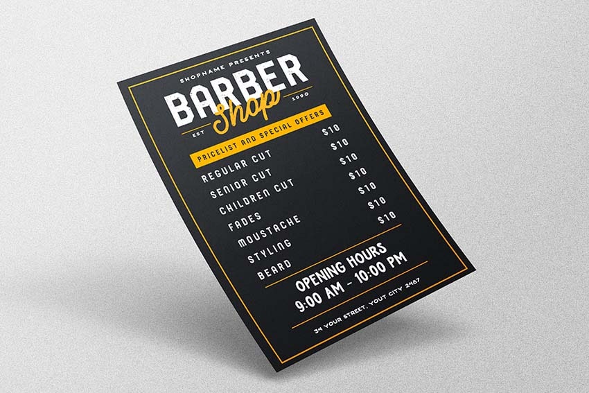


Are you wondering how to create a barber shop flyer design? Today, we're going to make one with standard Photoshop tools and a vintage font family. Then we'll take a look at the best barber flyer PSD templates on Envato Elements.
What You'll Learn in This Barber Shop Flyer Photoshop Tutorial
- How to create the base layout of your barber flyer PSD
- How to add your text and shapes to a barber shop flyer design template
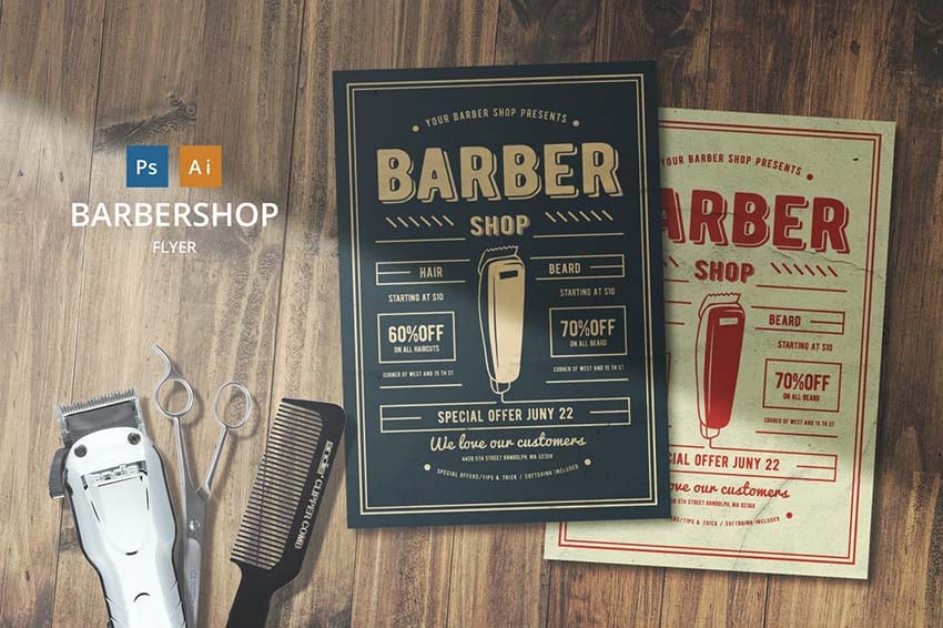
If you're looking for a high-quality barber shop flyer PSD template, check out this amazing barber shop flyer created by Lilynthesweetpea, with amazing vintage-inspired design and well-combined colors and fonts:
Barber Shop Flyer by Lilynthesweetpea (PSD, AI)


What You Need to Complete the Barber Flyer Template Tutorial
In order to complete this tutorial, you need the following assets:
1. How to Create the Base Layout of Your Barber Shop Flyer PSD
Step 1
Let's start by creating a new document with the following settings: Size: A4, 300 DPI, Color Mode: CMYK.


Step 2
Press Control-R to activate the guides and drag a Guide to each side of the document.


Step 3
Now hit Control-Alt-C and add 0.125 Inches to create bleeds.


Step 4
Press Shift-F5 and set Contents to Color, and use the following color code: #232528.


Step 5
Hit U and create a rectangle with the following settings:
- Size: 2310 x 3360 px
- Stroke Size: 15 px
- Stroke Color:
#faa31b
Then hold Shift and Move this layer to the center of the document.


2. How to Add Your Text and Shapes to a Barber Shop Flyer Design Template
Step 1
Now, let's create a first text layer using Douglas-Rutland with a size of 20 px.


Step 2
Let's add a bit more space between the letters. To do that, go to Window > Character and set the Tracking to 200.


Step 3
Put this text layer in the center of the document and then place it 110 px below the frame layer, as shown in the picture below:


Step 4
Now, let's add a text layer using the Douglas-Calgury font with a size of 133 px, and place it about 130 px below the previous text layer. Don't forget to change the Tracking to 0.


Step 5
Create another text layer using the Douglas-Aaronade font with a size of 93 px and the same yellow color as the frame.


Step 6
Press Control-T while your text layer is selected and Rotate it about 7.5°. Then put this layer slightly below the main text.


Step 7
Let's create two rectangles with a size of 360 x 8 px and yellow color. Move both rectangles to the center of the document while holding Shift. After that, move the first layer 632 px to the left and the second rectangle 632 px to the right from the Shop text layer.


Step 8
Then, add two small text boxes using Douglas-Rutland with 16 px size and white color. Put them 50 px below the lines and align them to the center of these lines.


Step 9
Create another yellow rectangle with a size of 1680 x 168 px, and put it 255 px below the previous lines.


Step 10
Add a text box with the Douglas-Calgury font and the following settings: Size: 20, Color: #232528, Tracking: 200. Put this text in the center of the rectangle.


Step 11
Now, let's create our price list. We'll use the Douglas-Calgury font with the following settings:
- Size: 27.3
- Tracking: 200
- Leading: Auto
- Align: Left.
Then create your price list and put it 100 px below the big yellow rectangle.


Step 12
Add your prices using the same font settings as before, but this time set the Alignment to the Right. Put this layer 100 px below the big yellow rectangle.


Step 13
Now let's add "opening hours" text lines with the Douglas-Burlington font with the following settings:
- Size: 41.5
- Tracking: 0
- Leading: 45
Create two lines of the text and put them 170 px below the prices.


Step 14
Let's create two more rectangles with the size set to 1680 x 10 px. Put the first rectangle 86 px below the opening hours layer, and move the second rectangle 86 px up from this text layer.


Step 15
And finally, let's add some text with the address of your barber shop. We'll use Douglas-Rutland with the size set to 18.6 px and put it 120 px below the bottom yellow line.


Awesome Work, You're Now Done!
Today, you've learned how to create your own barber shop flyer template in Adobe Photoshop using vintage fonts and standard Photoshop tools. You can use the same techniques for any other design projects or change the text to use this template for any other purposes.


5 Best Barber Flyer Ideas
If you are looking for high-quality and easy-to-use barber flyer templates or you want to get inspiration for your own barber flyer ideas, take a look at these amazing products, available at Envato Elements:
Barber Shop Flyer by Lilynthesweetpea (PSD, AI)
This barber shop flyer PSD template is a great combination of retro design and a clean layout. All you need to do is change the text and choose the color variation you like more.


Barber Shop Flyer by Vynetta (PSD, AI)
This barber flyer design is created in a "hipster" style with neat graphic elements. It offers a simple and clean layout, with placeholders for any information you might want to add, from an address to a price list.


Barbershop Flyer by Graphr (PSD, AI)
Still looking for barber shop flyer ideas? Take a look at this amazing barber flyer design with a great combination of colors and clean layout. All you need to do is place your text and voila! It's ready to print!


Barber Shop Flyer by Creativeartx (PSD, JPG)
Planning to open your own barber business? You will definitely need this amazing barber shop grand opening flyer! It combines a vintage-looking image of a barber chair and a retro color scheme. The template is well layered and extremely easy to customize. Try this one and you won't regret it!


Barber Shop Flyer by Guuver (PSD, JPG)
This barber shop grand opening flyer is a great choice if you want not only to show your price list, but also to promote your best barber! It can be a really nice way to promote your barber shop and attract new customers. This barber shop flyer design is easy to customize and ready to print!


If you want to find more barber shop flyer ideas and learn something new, take a look at these cool tutorials:


No comments:
Post a Comment