Having access to data gives people and companies a huge competitive advantage in today's world. Every company big and small likes to collect as much information about their market, customers, and products as possible. All this knowledge allows them to make informed decisions to improve their productivity and profits among other things.
However, people don't like to look at pages and pages of raw data. They are more likely to pay attention if the data is presented to them in a more visually engaging and organized manner. That's where data visualization comes in. In this article, I'll review the 8 best free data visualization libraries for JavaScript. I'll share a list of best free data visualization libraries for JavaScript with you that will help you create amazing charts and graphs to visualize all those numbers.
D3.js
D3.js is one of the first libraries that comes to mind when we are talking about best free data visualization libraries. The official website describes it as a JavaScript library for manipulating documents based on data.
There are clear reasons for its popularity that only become evident once you look at what the library is capable of doing. The library uses HTML, CSS and SVG to do all the visualization. You can use it to represent your data in all kinds of unique and interesting ways. If you can imagine it, you can probably build it with D3.js.
D3 demo by eyan.
One thing that you will notice as you learn more about the library is that it does not force you to represent your data in a specific way. This has its own advantages and disadvantages. On one hand, you will get a lot of flexibility in terms of what you can create with the library. The disadvantage is that the library has a relatively steep learning curve and you will have to write more code in comparison to libraries that specialize in showing data in specific ways like bar carts. This is evident from the line chart example on the D3.js website.
My recommendation would be that you consider using other libraries for very simple things such as line and bar charts. However, you should definitely take a look at the D3 gallery to see what kind of visualization is achievable with the library.
C3.js
Reading about and exploring D3.js might get you excited about all the things you could do with it. However, it could also be disappointing for people who want to create charts to visualize data but who find D3 too complicated. The C3.js library would be a great alternative in this case.
C3 demo by Bantsmore.
C3.js is based on D3.js and does all the heavy-lifting for you when it comes to generating a chart. It is simply a wrapper around D3.js with all the required code to create a chart. The good thing is that the charts you create are still highly customizable. Each element added by C3.js to create the charts has some classes given to it. This allows you to provide your own styling and also implement additional functionality by directly using D3.
You also get full control over the rendering of the charts through APIs and callbacks. This allows you to access the state of the chart even after it has rendered so that you can make further changes to it if needed.
You should check out the examples page to see what kind of charts you can draw with the library. Also make sure you read the documentation to see how to create all those charts.
Recharts
The Recharts library is built with React and D3. The library is designed to help you quickly integrate charts in your React applications. The library provides great performance with native SVG support and its dependency only on specific D3 submodules.
Recharts demo by StarNavi Team.
The charts can be built with reusable React components and they are easy to customize by making changes to component props and passing in custom components. There is a clear separation of components in Recharts making them independent. For example, a line chart will be made up of x axis, tooltip, grid and other elements which are all independent.
There are a lot of examples on the website that show you common charts types rendered with all their variants. The documentation explains how to create all these charts in great detail.
Chart.xkcd
Charts are one of the most common ways for visualizing data. Almost all libraries used to draw charts will create bars, lines and arcs that are just too perfect. This is actually intentional and very helpful because you want everything to look clean and accurate. What if that's not the case and you want to give your charts that "hand-drawn" feeling?
Chart.xkcd demo by Timqian.
The chart.xkcd library will do exactly that for you. It will give your plots a sketchy and cartoony feeling that sets them apart from charts drawn by other libraries. Creating the charts is an incredibly easy process and you don't need to write a lot of code.
The library supports six different chart types including line charts, bar charts, pie charts and radar charts. All of them have certain configuration options to change their appearance. You can also disable the hand-drawn effect during initialization.
DataMaps
The DataMaps library is a great way to create interactive maps for data visualization. All the code required to create the maps in bundled into a single file. It uses SVG to create the maps and can scale to any screen size. The library includes support for choropleths and bubble maps out-of-box.
DataMaps demo by Andy Wise.
You can get started with the maps by including D3.js and Topojson on your page. After that, just include the Datamaps.js file and define a container for the map. It is possible to create a map of any country by taking its topo.json file located here. The process for creating choropleths and bubble maps is explained in detail on the documentation page.
There are a lot of cutomization options included in the library for things like labels and popups. You can also listen to different events and make the maps responsive by hooking to resizing events.
Sigma.js
The Sigma.js library is ideal for people who want to create graphs that have to render thousands of nodes and edges.
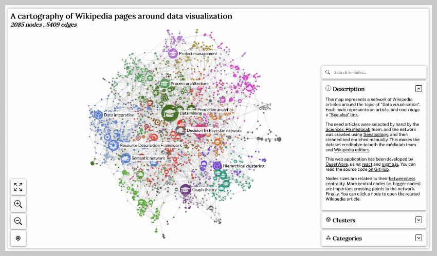


The library has shifted focus to management of graph display since version 2.0. This includes things like rendering and interaction. Other libraries are used to handle things like graph data structures, layout algorithms and metrics.
Sigma.js relies on WebGL to render graphs. This gives you a performance advantage over SVG and canvas when drawing larger graphs. However, there is a downside because customizing the graphs becomes harder. The library provides a wrapper for React so you can also use it inside your React applications.
Sigma is great for large graphs, but you should consider using D3.js if the graphs you plan to render will only have a few hundred nodes or if you want to customize the graphs to a large extent.
Deck.gl
The deck.gl library allows you to visually analyze large datasets. It is based on WebGL and aims to be very performant. It follows a layered approach when visualizing the data you give to it.
Deck.gl demo by Andy Wise.
Complex visualizations are made up by composing existing layers. Layers in deck.gl refer to a packaged visualization type that takes a data set and assigns positions, colors and extrusions to it before finally rendering everything on a map. You can render multiple layers while using the same data. The library comes with some well-tested and supported layers types such as bitmaps, columns, and contours.
The library utilizes the device's GPU to do high-precision computations for improved performance. You can use the library directly in your website but it also supports the React framework. You can also integrate it easily with popular base map providers like Google Maps, Mapbox, and ArcGIS.
Just checkout some of the examples on the website and you will be thoroughly impressed.
Cytoscape.js
Cytoscape.js is a graph theory library that tries to make data visualization and analysis as easy as possible for programmers and scientists. It allows you to model and visualize relational data with ease.
Cytoscape demo by Justin Mathieu.
The library comes with important functionality that gives users the ability to interact with different graphs. You can then listen to those user events and take appropriate actions if needed. It works perfectly on both desktop and mobile browsers. In fact, it has out-of-box support for gestures like pinch-to-zoom and panning etc.
Cytoscape is highly optimized for performance and supports a lot of functionality such as automatic or manual positioning of nodes, separation of presentation from actual data with the help of stylesheets, graph theory algorithms and set theory operations.
You should take a look at all the examples posted on the website and interact with them.
Final Thoughts
Visualization of large data sets through charts, graphs and other visuals can be very helpful when you are presenting information to your viewers. Luckily, JavaScript has a lot of free libraries to help you visualize all kinds of data. We have provided you a brief overview of eight such libraries in this post.
In short, you can use D3.js to do all kinds of data visualization. There are also specialized libraries based on D3.js that help you accomplish specific tasks like creating charts much more quickly. Other libraries like deck.gl can help you visualize location based data with information plotted on maps.
Hopefully, you will find at least one of the libraries listed here useful. You can also head over to GitHub and search its repositories to find a free data visualization library.

No comments:
Post a Comment