Monday, November 30, 2020

What Is Illustration? (And What Are the Different Types of Illustration?)

What Is Illustration? (And What Are the Different Types of Illustration?)
Final product image
What You'll Be Creating

Do you want to know more about illustration? Or do you want to become an illustration artist? Digital illustration, scientific illustration... such a lot of terms! In this article, you'll learn the meaning of illustration, discover illustration types, and much more!

1. What Is Illustration?

Let's dive into an illustration definition. In short, illustration is a visualization made by an artist. It is a drawing (or painting, collage, engraving, photo, etc.) that explains something. The illustration doesn't have to be drawn—a photo in an encyclopedia is also an illustration, because it explains what is written. 

So if your drawing is not explaining something, it is a work of art, not an illustration. We will talk about the differences between art and illustration later.

An illustration can explain an idea even without the text nearby. People who look at the picture should see the story, "read" it as they would read the text. To tell a story with an illustration means to convey some meaning, to explain a certain context only with the help of an image.

The example of an illustration without text
This music festival poster is also an illustration because it illustrates the mood of the festival

Interesting fact: the word illustration comes from the Latin illustrate, which means spiritual or intellectual enlightenment. Wow!

2. Different Types of Illustration

Let's learn more about the types of illustration and where they are used. There are a lot of areas that require visualization; here are some of them:

  • editorial illustration
  • advertising illustration
  • concept art
  • fashion illustration
  • technical (scientific) illustration
  • infographics
  • packaging illustration

What Is Editorial Illustration?

An editorial illustration is an illustration created to better express an idea from the text, usually used in a book, magazine, newspaper, or web resource. This type of illustration can't live without the text. If you want to know more about it, read our tutorial about editorial illustration.

What Is Advertising Illustration?

It is an illustration that is used in promotional material, and its main aim is to catch the viewer's attention. It can be used without any text (only the logotype of the company) but express a strong idea to make it easy to remember.

Advertising illustration example
This e-commerce sale illustration is easy to understand even with very little text

What Is Concept Art?

Concept art is used in movies, games, and other industries, as working material for finding the best image of the atmosphere of the work. Concept art is usually created in several iterations. The most important thing is not to create a perfectly beautiful image, but to choose the appropriate image. The final product uses the final sketch that went through the art director's criticism. Concept art is usually made for environments, characters, costumes, and items.

Characters concept art
Concept Art of cute mascot characters. Different concepts give more choices to use.

What Is Fashion Illustration?

Fashion illustration can be used to visualize a piece of clothing before it’s produced. Fashion designers use it a lot in their creative process. The garment should be drawn before being sewn. Also, fashion houses use fashion illustrators' work to promote their product and to show it in a special style.

Fashion illustration
This trendy girls illustration is a typical fashion illustration

What Is Technical Illustration?

The purpose of a technical (scientific) illustration is to accurately depict an object in order to simplify its understanding. In technical illustration, it is not the image and beauty that is important, but the clarity of the image and the absence of confusion.

Technical scientific illustration
This technical planet illustration shows the structure of the earth's core.

What Are Infographics?

Infographics are a selection of images and diagrams with a minimum of text, allowing you to quickly understand the essence of the topic. Infographics are related to communication and graphic design, but can also be attributed to illustration. Good infographics make it easier to understand information and a large amount of data.

Infographics example
Infographics can be on different topics, like this example of a Covid-19 virus infographic.

What Is Packaging Illustration?

Like advertising illustration, packaging illustration helps companies to sell their product. And it also should be eye-catching and grab the viewer's attention. But also, packaging illustration helps to define the brand, adding a personalized touch and custom feel. 

Packaging illustration
Bright and colorful fruit illustrations are very typical for packaging design.

3. The Difference Between Graphic Design and Illustration

Usually, graphic designers work with ready-made objects, and their task is to create suitable compositions from them. Illustrators create products themselves (even if they are collages).

The main task of the designer is to create a successful product that will meet the requirements of the customer and the needs of the target audience.

A good illustrator will also think about the needs of their client and target audience, but should be more focused on the image itself, rather than on marketing goals—which the designer has already thought about!

Illustrator at work
llustrator at work illustration

4. The Difference Between Art and Illustration

Illustration art is not art in the literal sense of the word. Art is created to express the inner world of the artist, while an illustration is created to explain an idea. The main goal of a work of art is aesthetics. The main purpose of an illustration is to explain. An illustration is created for the needs of a specific customer with specific goals, and a work of art can be made without it. Good illustrators always think about their viewers' and their clients' aims.

5. What Are the Best Illustration Techniques?

It doesn't matter what technique the illustrator uses; what's important is what the illustration is for. This is not a story about how to create an image, but rather about what the purpose of the image is.

A commercial illustration can be traditional in technique: then it is drawn in pencil, ink, and paints. It can be made in digital programs such as Photoshop, Illustrator, Procreate, and others.

Some illustrators use a mixed technique: for example, draw with a pencil, and then process the image on the computer. There are also those who use the collage technique and engraving. You can use any technique; it depends on the purpose of the work and the preferences of the illustrator.

Example of engraving illustration
These vintage engraving horses can be used as a good illustration in an encyclopedia.

6. How to Become a Professional Illustrator

It all depends on the field in which you want to develop, and the technology that you will use. To become an illustrator, it is desirable to be able to draw. But now this is not the main thing, because there are illustration techniques that are not directly related to drawing. But you will definitely need a good knowledge of composition, color, and perspective, and a lot of practice. 

There are a lot of online courses and universities where you can get an education. I advise you to choose courses that focus on the basics of composition and the ability to work with text rather than on individual techniques and materials. Many good tips are collected in our article about editorial illustration.

Knowledge of the basics of marketing, the skill to work with the client, and understanding of legal subtleties will be a good help.

Happy student illustration
Illustration of happy students who just finished their illustration course!

Conclusion

Illustration is a very interesting area that simultaneously contains a lot of creativity and close work with the client and designers. But the pleasure when you see your work printed in a magazine or on a shelf in a store cannot be compared to anything!

I wish you good luck and patience on this difficult but very exciting journey.

Want to learn more about illustration and graphic design? Check out our other tutorials and articles! I'm absolutely sure that you will find the perfect tutorial for improving your skills.


How to Use Tone Curves to Correct and Adjust Photos in Adobe Camera RAW (Free)

How to Use Tone Curves to Correct and Adjust Photos in Adobe Camera RAW (Free)

Curves tools can be really useful for your editing process, giving you greater speed and control over exposure, contrast and even colour, over the dynamic tonal range of your image. Here we'll take a look at the Curves tools in Adobe Camera Raw.

What is a Tone Curve?

Tone curves represent the range of tones and changes between them in your picture.

‘The horizontal axis represents the original tone values of the image (input values), with black on the left and progressively lighter values toward the right. The vertical axis represents the changed tone values (output values), with black on the bottom and progressing to white at the top.’  Source: Adobe

You'll usually use the Curve options to adjust contrast and exposure, though you can do more than that by also adjusting specific colour channels within the Curves tools too.

How to use Tone Curve in Camera Raw

You’ll have noticed that in the more recent updates to ACR, the Tone Curve section has changed a little. If you’re following along and have an older version of the software, it might be worth you updating – you can do this for free if you have either a current CC subscription, or have an active older version of linked Adobe software like Photoshop or Lightroom.

Make Basic Adjustments First

You should use the Tone Curve adjustments once you’ve already made your Basic adjustments, using the tone curve to fine tune rather than make massive changes.

image with basic adjustments
Image with basic adjustments

This is the image I’ll work with to demonstrate. I’ve made a few basic adjustments like dropping the highlights to bring back some of the blue sky, brightening the shadows and adding a little contrast and texture.

Tone Curve

Parametric Curve and Point Curve

parametric and point curve
Parametric and Point Curve

If you’ve used curves in the past, you’ve probably been used to Point Curve. Parametric Curve can be used in addition to point, changing one won’t alter the other.

Parametric Curve

Parametric Curve splits your tones into sections: highlights, lights, darks and shadows, and you’ll see you have sliders that you can adjust that reflect those. Unlike Point Curve which I’ll go into shortly, Parametric Curve will limit your dragging of points to that group of tones and won’t let you go beyond that.

Although just to throw some confusion into the mix, you do have a strip above the sliders with three points on. Moving these points will increase the range of the tones. For example, if you shifted all the dots to the right (towards highlights) then making changes to the ‘shadows’ slider would have an increased effect, as it would now take ‘shadows’ to mean you want to include all the tones up to that first dot!

dots and sliders
Dots and sliders

The good thing about Parametric Curve is that it makes it more obvious (than Point Curve) which tones you’re affecting. If you hover over the graph to make changes, rather than via the sliders, it’ll tell you when you move from shadows (your darkest tones) to darks.

showing tonal region
Parametric Curve tonal region

Making and dragging a point on the graph will only let you make vertical changes, so an increase or decrease in the point you’ve selected and that will then be reflected on the corresponding slider. It’s easier to make changes to Parametric Curve with the sliders.

If you aren’t familiar with curves, Parametric Curve will be the easiest option to use and it will help prevent you from making any crazy adjustments that will make your image look odd.

Point Curve

Point Curve will still give you the most control because you have more freedom to create extra control points and make more targeted adjustments to the tones in your image.

Point Curve has some standard options to choose from: Medium Contrast and Strong Contrast.

point curve set to strong contrast
Point Curve set to Strong Contrast

Above, Strong Contrast is selected, which you can see puts the line on the graph into a gentle ‘S’ curve, meaning the shadows are deepened, the lights are lifted and the midtones stay much the same.

If I exaggerate that ‘S’ (below) you can see the image would be very high in contrast, to the point where tones at both ends of the graph are lost and everything looks a bit over the top and unrealistic.

exaggerated s curve
Exaggerated 's' curve

If you like a matte effect on your shadows, you can leave the ‘S’ curve in place and then lift the furthest left control point (the shadows) up to create a slight ‘U’ shape.

matte effect
Using curves to create a matte effect

Red Channel, Green Channel and Blue Channel

red blue green channel
Red, Blue, Green Channels

This set of options also don’t change anything you may have done to parametric and point curve. They work in a similar way to the previous curve descriptions, only this time they focus on just one set of colour values.

making everything blue
Making everything blue...

If we take the blue channel as an example, making a control point in the middle and dragging it up would make the midtones bluer, as seen in the image above. If I dragged it down, it would make them more yellow.

You can use these to apply more thoughtful colours to specific tones. For example you might want to add some cooler tones to your shadows, which might look like this.

adding blues to shadows
Adding blues to shadows

Each colour channel will have its opposite on the colour wheel as a negative value. So for example the red channel has cyan, so a lift in control points would increase red and decrease cyan – pulling that point down instead would do the opposite, increase cyan and decrease red within that tonal range.

Finishing Up

before and after
Before (left) and After (right) curve adjustments

Curves are great ways to make smaller adjustments to your images – changes that affect the exposure, contrast and colours. Be wary of doing too much in curves though, you can quite quickly pull control points beyond the reasonable limits of your photographs and end up with something that just looks a little odd!

When used properly, curves can give you more targeted adjustments to specific tonal regions that other editing panels can’t, which gives you greater control over your whole dynamic range. If you’re new to curves, I’d recommend starting with Parametric Curves which will keep you within the limits of your available tonal range. It’s also easier to adjust because of the sliders. It’s worth playing around with the Point Curve and Colour Channel tools though, to see what results you get and to learn which adjustments will work for your image.

Finally, if you're still using an older version of Adobe Camera Raw the Curves tool will look a little different, and you might find this video useful:

More Help With Adobe Camera Raw


How to Use Figma’s New Auto Layout Features

How to Use Figma’s New Auto Layout Features

In this video I’ll show you how Figma’s new and improved Auto Layout features make designing responsive components and layouts easier than ever!

Figma’s original Auto Layout features were introduced in December 2019–and now, almost a year later, Auto Layout has been completely reimagined, rebuilt and is (in my opinion) much better.

Watch the Video

What is Auto Layout?

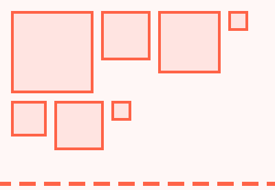
Figma’s Auto Layout allows you to create dynamic frames which adjust to their content. Here, for example, is a simple frame which contains some shapes:

simple frame in Figma

By selecting the frame, then clicking the Auto Layout button in the sidebar, the shapes within the frame are arranged more efficiently and the frame itself adjusts in response to the area they occupy:

auto layout frame figma

You’ll notice in the Auto Layout properties that we have Horizontal selected. This arranges the shapes horizontally within the frame. We can also choose Vertical and apply a number of other settings giving us great levels of control over alignment, distribution, and spacing.

This is a very basic demonstration, but with Auto Layout features we can create buttons which resize according to their content, or menus which do the same, even whole layouts which shift and adjust responsively. It’s without doubt my favorite feature within Figma.

New Auto Layout Features in Figma

As I mentioned earlier the concept of Auto Layout is nothing new to Figma, but this recent incarnation of it comes with plenty of new features. Check out the video above for complete demonstrations of these features—here’s a quick summary:

Padding

Imagine you create a text object for a button. You add the text to the workspace, then right-click > Auto Layout. Doing so immediately creates a frame around the text object (see the layers panel), applies a default 10px of padding between the items (we’ll get to this in a moment) and a default 10px of padding around the object (see the properties panel):

default padding on auto layout frame

These values can be changed by entering different numbers. In the old version of Figma Auto Layout you could apply padding by specifying horizontal and vertical values, but in this new Auto Layout you can enter values for top, bottom, left, and right, all within the Alignment and Padding panel:

alignment and padding

Resizing

We also have some exciting new options for resizing. For example, we can apply Auto Layout to a button (just like above) then in the Resizing properties we can apply Hug Contents both vertically, and horizontally. This makes the parent frame “hug” the button by resizing itself depending on how big the button is

Alternatively we can set this resize value to Fixed Width and Fixed Height. As you might expect, this allows you to enter a fixed value for the width and height of the button.

The last possible value here is Fill Container, which will make the button as wide or as tall as the available space in the parent container allows. 

These three approaches to the sizing of objects, especially as you can use any combination you like on one object, allow total control when dealing with whole page and component layouts.

Alignment

The new Figma Auto Layout offers us some new alignment control too. In the old version of Auto Layout you would perform any alignment at the “child level”, ie. on the objects themselves. Now, you apply alignment properties to the parent container.

You can see the how alignment is impacting the child objects in the Alignment and Padding panel we looked at earlier:

alignment of objects

In the image above you can see that objects within this frame are aligned to the top left. The space between the items is specified in the Spacing Between Items box we saw earlier. You can also see that the mouse cursor is hovering above what would be top center alignment. You can click anywhere in this space to change the alignment visually.

Personally I quite liked the older version where I could align objects individually, but I can see how this approach makes sense. If you’ve ever looked at Flexbox and how it applies alignment in CSS, you’ll see common elements in its behavior.

The layout shown above used the Packed distribution, but there are other forms of distribution too. Space Between, for example, effectively distributes the objects across the whole width or height of the parent container (depending on the alignment direction), with equal space between each one.

Learn More About Figma Auto Layout

That completes this introduction to Figma’s new Auto Layout features! I created a course a short while ago explaining the “old” Auto Layout features in Figma in greater detail. The features have been completely rethought since then, but the principles and best practices I cover are still perfectly relevant. Check it out!

Useful Resources and Figma Tutorials