
In today's tutorial, I'll show you how to make a fairy-tale book cover with a vintage-inspired look.
Vintage-style covers are big news in publishing right now, and clothbound covers are enjoying a well-deserved resurgence. Here you’ll learn how to make a vintage book cover and recreate the look with woodcut-style illustrations and calligraphy type. We’ll look at how to make a fairy-tale book front cover and decorative spine step by step, using Adobe Illustrator, Adobe Photoshop, and Adobe InDesign to put the artwork together.
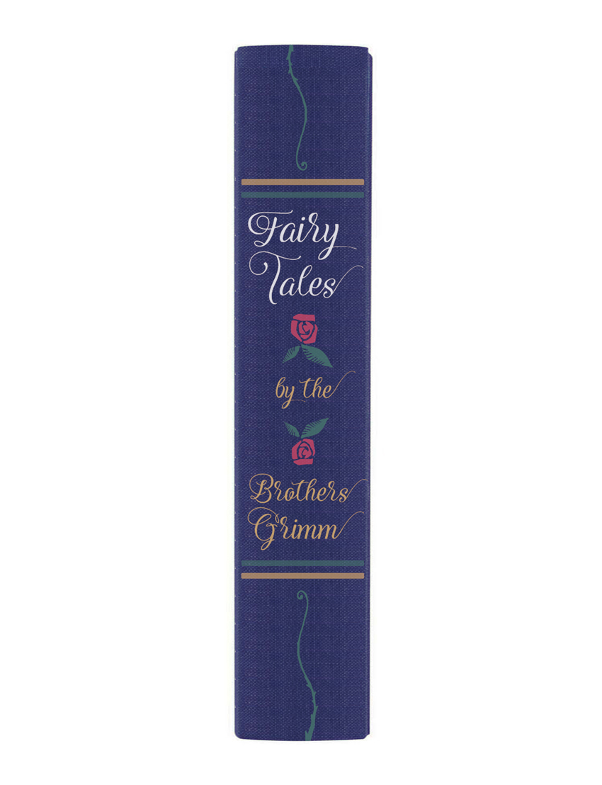
We’ll also be revisiting some drawing skills, so make sure to have a pencil, pen, and paper to hand too!
Ready? Fantastic, let’s get started...
What You Will Learn in This Fairy-Tale Book Cover Design Tutorial
- How to plan and make a vintage book cover in InDesign
- How you can vectorize artwork in Photoshop
- How to add linocut details in Illustrator
- How to finalize the fairy-tale book cover design in InDesign
- How to create a decorative spine in InDesign
What Will I Need to Make a Vintage Book Cover?
For this fairy-tale book cover design tutorial, you’ll need access to the following programs:
- Adobe InDesign
- Adobe Illustrator
- Adobe Photoshop...
... plus pencil, pen, and paper.
To recreate the fairy-tale book design pictured, you’ll also need to download the following images, brushes, and fonts:

1. How Should I Plan My Cover Design?
Illustrative cover designs require a bit of forward thinking—the fairy-tale book design will look more seamless and beautiful if we map out the cover first.
In this tutorial, I’ll show you how I created the design pictured below, but you can apply the same techniques to your own designs and illustrations if you like. It’s a great opportunity to flex your creative muscles!
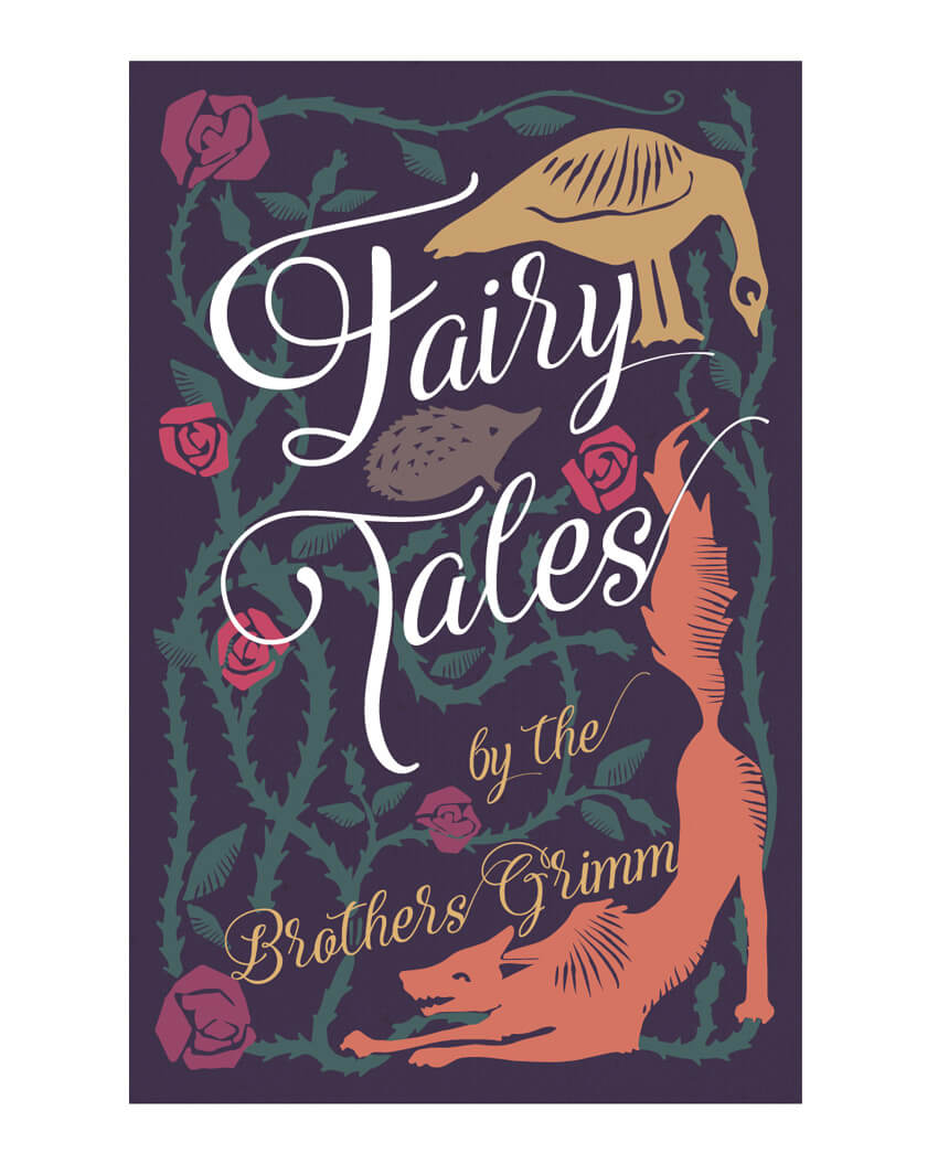
First up, let’s start mapping out the typography for the front cover...
Step 1
We’ll start in Adobe InDesign—open up the program and go to File > New > Document.
Set the Intent to Print and Number of Pages to 1.
Under Page Size, set the Width to 132 mm and Height to 204 mm. This is equivalent to a trade-standard B-Format hardback size.
Keep the Margins to their default value (12.7 mm) and add a Bleed of 5 mm.

Click OK.

Step 2
Take the Line Tool (\) and drag onto the page to create a short, slightly diagonal line from left to right. The idea is to create several lines of italic text, using the lines as text paths.

Switch to the Type on a Path Tool (Shift-T), and click onto the line (when you can see a "+" sign appear next to your type cursor).

Type in "airy". From the top Controls panel, adjust the Stroke Color of the path to [None].

Highlight the text and open up the Character panel (Window > Type & Tables > Character). Set the Font to Adorabelle Regular, Size 120 pt. Apply a Skew (false italic) of 7°.

Expand the Swatches panel (Window > Color > Swatches) and click on the New Swatch button at the bottom of the panel. Set the Type to Process, Mode to CMYK, and levels to C=13 M=29 Y=66 K=0. Rename the swatch Gold and click OK.

Apply the new swatch to the Font Color of "airy".

Step 3
Select the type path and Edit > Copy, Edit > Paste, positioning it slightly below the first, to the left side. Adjust the text to read just "F", and increase the Font Size to 200 pt.

Step 4
Continue to Copy and Paste paths and adjust them to read the rest of the title, in this case "F", "airy", "T", "ales", "by the", "Brothers Grimm", setting the text in Adorabelle and adjusting the Font Size to create a hierarchy.

Make sure you're completely happy with the text arrangement on the page—once you begin illustrating around the type, you won't be able to move it. Once you’re happy, go to File > Print and print out the cover to size onto a piece of A4- or Letter-sized paper.
You may find it helpful to use the Rectangle Tool (M) first, to mark out the trim edge of the paper in black, so you can see where the cover ends.

Step 5
Once you have your typography printed out, you're ready to start illustrating your fairy-tale cover.
Illustrations in a woodcut style will add the perfect look to your old book design cover. With simple chunky edges and solid silhouettes, these images will look incredibly charming on your fairy-tale book design.
Google "woodcut art" to browse examples of the style and find inspiration for your cover. Some woodcut designs are very complex, but we’re aiming for more simplistic, naive designs, which not only look great on antique book cover designs but are also easy to create.
Grab your pencil and get started!
Start with the larger features of the design—here I wanted to have a wolf curved around one corner of the old book design cover and a goose at the top right: both popular subjects in the Grimm fairy tales.

Then I start to think about the smaller details of the design. Intertwining rose stems are easy to draw and create a beautiful framing effect for the rest of the content. I decorate the tops of stems with simple rosehip silhouettes and add leaves to some of the sides.
I continue to build up the design in pencil, adding roses in the corners and a little hedgehog between the text of the title.

Allow some of the design to cross in front of and behind the curves of the text—this will help to create a more unified, fluid design.
2. How Do I Vectorize My Artwork?
Step 1
When you’ve finished your pencil design, you need to think about which areas of the design you’d like to pull out in different colors for your fairy-tale cover.
Ultimately, I want the rose stems and leaves to be a different color from the rest of the design. To do this, I’ll need to pull them out in a strong color by hand, and then scan the design and edit it in Photoshop.
Pick your first one-color feature and take a black ink pen. Color in the whole element in black, trying to keep the silhouette as solid as possible.

Scan the drawing into your computer, or take a high-resolution digital photo on a phone or camera. Open up the image in Adobe Photoshop.

Duplicate the Background layer to create a copy of the image, and switch off the visibility of the background layer.
Add a Levels Adjustment Layer, and drag the sliders to the far right of the graph to bring out the black of the inked image in high contrast.

Then File > Save As the image as a PSD file. Name it after the element, e.g. "Thorns.psd".
Step 2
Minimize Photoshop for now, and open up Adobe Illustrator. Create a New Document, 132 mm in Width and 204 mm in Height to match the cover dimensions.

File > Place the image of your edited image, in this case "Thorns.psd". Resize it to fit the cover.

Go to Window > Image Trace to open up the Image Trace panel. Select the image and, in the panel, set the Mode to Black and White. Check the Preview box to view the result.
From the Advanced options, select Snap Curves to Lines and Ignore White. Adjust the Threshold, Paths, Corners, and Noise sliders until you’re happy with the result.

Then go to Object > Image Trace > Expand to transform the image into a vector.

Right-Click (Windows) or Control-Click (Mac) > Ungroup to make all the parts of the vector editable.

Delete any background remaining, and any extra unwanted bits picked up by Image Trace. You’ll end up with a beautiful vector version of your image, true to size.

Step 3
Now we need to repeat the process for the remaining elements on our pencil design. So head back to your paper design, and seek out a contrasting color pen—a striking red or blue would be ideal!
Color in the remaining elements on your design in a contrasting color, and then scan the image into your computer.

Open up the image in Photoshop, duplicate the Background layer, and go to Select > Color Range.

Click onto the colored areas to pick up that color alone, and then Edit > Copy and Edit > Paste, moving just this color onto a different layer. Applying a white rectangle onto a layer below this will help you to see the isolated artwork more clearly.
Then apply a Levels Adjustment Layer, as before, pulling the sliders across to the extreme right side, transforming your elements to high-contrast black.

File > Save As the image as a PSD file, with a name like "Animals.eps".
Step 4
Return to your Illustrator file and create a New Layer from the Layers panel. File > Place the "Animals.eps" file onto this layer.

Trace the image and vectorize it using the process described in Step 2, above.


3. How Do I Add Linocut Details?
Good brushwork can go a long way in making an authentic antique book cover design. To give the illustrations a more accurate woodcut look, we can add brush details to our vectorized elements.
Make sure you have opened up the Lino Cut Brushes set in Illustrator, so they're ready at hand.
Step 1
We’ll just work on the larger elements of the fairy-tale book cover design for now (here, the animals), so make sure the layer below is locked or not visible. You can apply a temporary bit of color to the elements too, if you like. This can help to make your brush strokes appear more visible if set in black.
Take the Paintbrush Tool (B) and select one of the linocut brushes. Experiment with different brushes until you find a style that suits a particular element on your design.

When you’re happy with the brush stroke, go to Object > Path > Outline Stroke.

Then Right-Click (Windows) or Control-Click (Mac) > Ungroup the different parts of the texture, if required.

Select both the silhouetted image and the brush-stroke elements, and Right-Click (Windows) or Control-Click (Mac) > Make Compound Path. The brush-stroke elements will be cut out of the silhouette to create that lovely woodcut effect.

Step 2
Repeat the process with the other larger elements, as I’ve done with this wolf illustration. Dashed shading looks great on larger elements to break up a solid silhouette.

Outline the stroke; Ungroup the elements, and Make Compound Path.


Use the Eraser Tool (Shift-E) to separate any outlying parts of the brush strokes from the main silhouette.

Select them and delete them to make a neat and tidy design.

Step 3
Repeat the same process for the elements on the layer below, adding small linocut brush strokes to small items like leaves to add detail and interest.


4. How Can I Finalize the Front Cover in InDesign?
Now that we’ve vectorized the illustrations for the fairy-tale cover, we’re ready to lift the designs into InDesign and finalize the cover design.
Step 1
Make sure the bottom layer of your Illustrator file is the only one unlocked, and then select everything on the page and Edit > Copy.
Return to your original InDesign file, with your original typography design. Expand the Layers panel (Window > Layers) and double-click on Layer 1 to open the Layer Options window. Rename the layer Typography in Front.

Click on the New Layer button at the bottom of the panel to create a new layer and rename this Texture. Drag it down to sit below the Typography in Front layer.

Create a second new layer, above Texture and below Typography in Front, and rename it Background.

Step 2
Lock both the Typography in Front and Background layers, and click on Texture to activate it.
Take the Rectangle Frame Tool (F) and drag onto the page to create an image frame that extends across the page, up to the edges of the bleed on the top, right, and bottom sides.
File > Place, and choose the canvas texture image you downloaded earlier. Position it so that it fills the image frame completely.

Step 3
Expand the Swatches panel and create a new CMYK Process swatch. Name it Background Purple and set the values to C=95 M=100 Y=59 K=24.

Lock the Texture layer and unlock the next layer up, Background. Select the Rectangle Tool (M) and drag to create a rectangle that matches the dimensions of the canvas image frame below. Set the Fill Color to Background Purple. Go to Object > Effects > Transparency and set the Mode to Multiply and Opacity to 90% to pull through some of the canvas texture below.


Step 4
Create a new CMYK Process swatch. Name it Green and set the values to C=74 M=37 Y=57 K=15.

Lock the Background layer, and then create a new layer called Thorns to sit above Background and below Typography in Front. Edit > Paste to drop the copied thorns vector onto the page. You can resize it if needed, and then hop up to Object > Effects > Transparency, reducing the Opacity to 70%.


Step 5
Create a new layer, Typography Behind, and position this above Thorns and below Typography in Front. If you want any of the text elements to sit behind larger elements of the design, such as animals or roses, drag text paths from the Typography in Front layer onto this layer below. This is completely optional, but can help your design to feel more layered and 3D.
I’ve also pulled out the main title in a contrasting bright white Font Color (choose [Paper] from the Swatches panel).

Step 6
Return to your Illustrator document, and lock the bottom layer. Unlock the top layer, containing the vectorized version of the larger elements on your design, and sweep your mouse across the page to select everything. Edit > Copy.
Return to your InDesign document and create a new layer, Animals and Roses, and place this between the Typography in Front and Typography Behind layers.
Edit > Paste to drop the vectorized animals and roses onto the page. Readjust the position and size if needed.

Step 7
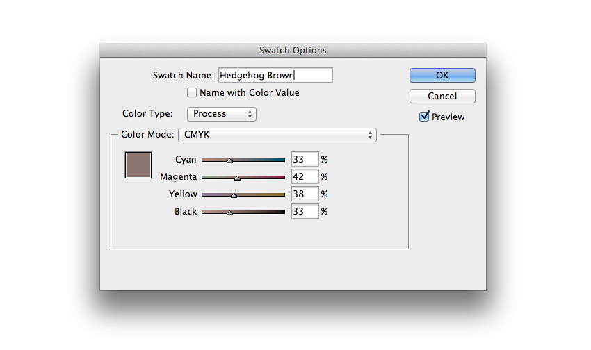
Create a new CMYK Process swatch, C=33 M=42 Y=38 K=33, and name it Hedgehog Brown.
Create a second new CMYK Process swatch, C=12 M=65 Y=64 K=0, and name it Orange.

Create a third new CMYK Process swatch, C=47 M=88 Y=49 K=0, and name it Dark Pink.

Create a final new CMYK Process swatch, C=21 M=88 Y=49 K=0, and name it Pink.

You can use these colors as you wish to apply to your own designs, or if you’re recreating the design pictured here, you can apply the Hedgehog Brown to the hedgehog vector, Orange to the wolf, and Dark Pink and Pink to the roses, varying the two tones to create depth.
Step 8
Some of the larger silhouettes will benefit from having some of the texture on the layers beneath being more visible through them. To do this, select a vector shape, go to Object > Effects > Transparency, and set the Opacity to 90%.


Feel free to add further details to the design if you feel it needs something more. Here, I’ve added a few extra small roses set in Pink and Dark Pink to add more detail to the left side of the old book design cover.

Your front cover design is finished—great work! If you’re planning on using the cover digitally for an EPUB, your job is pretty much done—you can File > Export the artwork as an Interactive PDF.
If you want to find out how to create a decorative spine for your fairy-tale book cover and expand the design into a full wraparound cover, read on...
5. How Do I Create a Decorative Spine?
Step 1
This is a good time to File > Save your InDesign artwork, so make sure to do that now before proceeding.
Expand the Pages panel and click on the Create New Page button at the bottom of the panel.

This page will be our full clothbound cover design and will include space for a back cover, spine, and front cover.
To work out the correct width of the page, we need to know the correct spine width for the book. Let’s say we’ll be working with 500 pages on 130 gsm coated paper. Using this helpful online spine calculator, you can work out that this will mean we have to accommodate a 36 mm spine, plus add an extra 3 mm to allow for the extra wraparound required on a hardback’s spine.
Once you’ve figured out the spine width, you can calculate the full width of your old book design cover:
Front Cover Width + Back Cover Width + Spine + 3 mm (for hardback) = Total Cover Width
So for this cover, that will mean...
132 mm + 132 mm + 36 mm + 3 mm = 303 mm
Select the Page Tool (Shift-P) and click onto Page 2 of your document to select it. Type 303 mm into the Width text box at the top-left corner of the Controls panel.


Step 2
Ensure the rulers are visible (View > Show Rulers) and pull out a vertical guide from the left-hand ruler to 151.5 mm, to mark out the center point of the spine.

Pull out guides to 133.5 mm and 169.5 mm to mark out the edges of the 36 mm spine.

Finally, pull out guides to 132 mm and 171 mm to mark out the extra space needed around the spine edge for folding.

Step 3
Unlock only the Texture layer, keeping the other layers locked, and Edit > Copy the canvas texture image frame on Page 1. Edit > Paste in Place onto Page 2.

Paste again, positioning it over on the left side of the page.

Paste a final time, resizing the width to fit the remaining spine gap.

Step 4
Lock the Texture layer and unlock all other layers. Drag your mouse over the whole of Page 1 to select all the front cover artwork and Edit > Copy.

Scroll down to Page 2 and Edit > Paste. Position it over on the right-hand side, making sure it fits to the bleed edges perfectly.

Then select only the background color rectangle and extend the width so that it reaches to the far left edge of the bleed.


Step 5
Zoom in on the spine of the cover, using the guides as a reference. Lock all layers except the Typography in Front layer. Take the Type Tool (T) and create a staggered group of text frames. Type in the words of the title and author names, in a similar arrangement to that shown. Set the Font to Adorabelle, and match the colors to the front cover.

Step 6
Lock the Typography in Front layer and unlock the Thorns layer.
Use the Rectangle Tool (M) to create a thin rectangle 36 mm in Width. Set the Fill Color to Gold, and go to Object > Corner Options. Add a 5 mm Round shape on all corners and click OK.

Move the bar above the title on the spine, and Copy and Paste to create a copy directly below, which you can put in a different color, like Green.
Copy and Paste the pair and position below the author's name, as shown. This gives the cover an authentic hardcover look.

Select all the bars and go to Object > Effects > Transparency, reducing the Opacity to 80%.

Step 7
Now you can add some more creative details to the spine. You can either create a custom design for the spine, as we did for the front cover, or simply borrow individual vector elements from the front cover and give them a new twist.
Here, I’ve taken the curvy tip of one of the rose stems, separated it, and placed it at the top and bottom of the spine.


I also took individual rose vectors and placed them, alongside some leaves, above and below "by the" on the center of the spine.

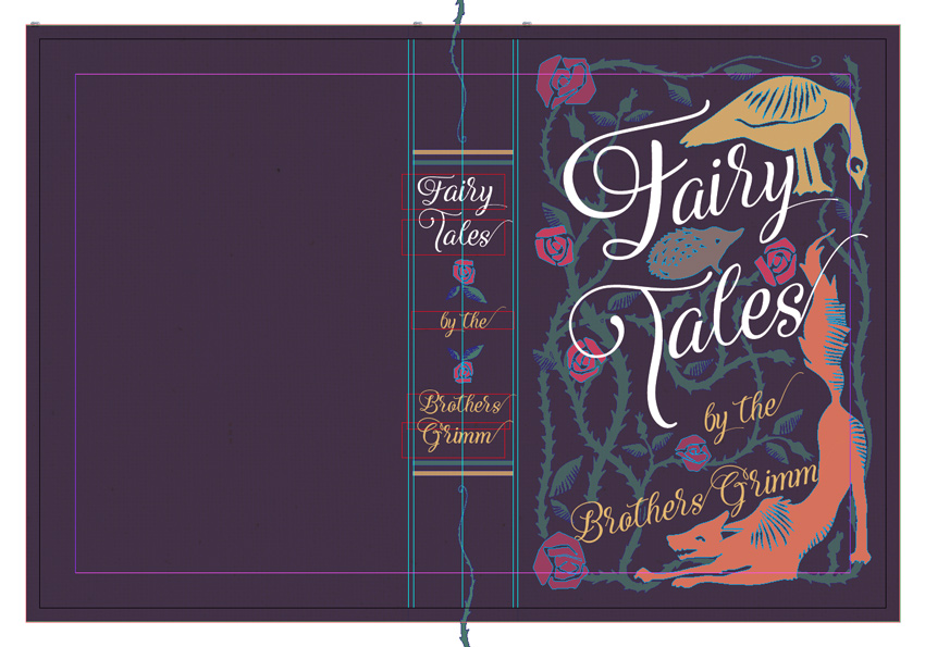
You’ll end up with a cover complete with decorative spine and front cover design!

Your Finished Fairy-Tale Cover
In this tutorial, we’ve looked at how to make a vintage book cover for a book of fairy tales. Using hand-drawn illustrations and then editing them in Photoshop and Illustrator, we’ve been able to learn how to make a fairy-tale book cover and recreate a gorgeous woodcut style that looks really charming and beautiful.

You can be as creative as you like with the back cover too—why not create an illustrated design to surround a blurb or give a bit of a decorative flourish to the edges of a barcode? The only limits are your imagination, so get creating! You can share your final results in the comments below.
Once you’ve completed your cover, you can export it as a Press-Quality PDF by going to File > Export. Make sure to include the bleed if you’re sending it off for professional printing and binding.
We’ve covered a range of skills in this tutorial, applicable to professional publishing and self-publishing design. You should now feel more confident in:
- ‘mapping out’ typography for illustrative cover designs in Adobe InDesign
- creating hand-drawn woodcut illustrations with simple, chunky silhouettes for high impact
- preparing hand-drawn artwork for vectorizing in Adobe Photoshop
- vectorizing and adding linocut brush details to your artwork
- building up texture and color in your front cover artwork
- expanding your cover design to a full wrap-around cover, complete with a decorative spine
That’s fantastic work—congratulations! If you’d like to share your cover artwork in the comments below, I’d love to see them!
Create a Vintage Fairy-Tale Book Cover With Placeit
You can also check out Placeit’s library of book cover templates for an easy way to design a book cover right in your browser. It has everything from fairy-tale book cover designs to crime covers. You can find the perfect book cover maker, like the below fantasy novel cover, for your latest work.

And if you liked learning how to make vintage book covers, Envato Tuts+ has more great book and magazine tutorials that you can try out too!
 InDesign TemplatesHow to Make an InDesign Book Template (Cover & Layout)
 InDesign TemplatesHow to Create a Book Jacket Template in InDesign
 Book CoverHow to Design a Romance Book Cover
 ComicsHow to Make a Comic Book Cover
 Adobe InDesignCreate Beautiful Page Layouts and a Striking Cover for a Children’s Fiction Book
 InDesign TemplatesHow to Create a Page Layout for a Children's Book in InDesign
 Magazine Design10 Tips for Designing High-Impact Magazines
 Magazine TemplatesHow to Create a Magazine Cover Template in InDesign
 Book CoverHow to Make Your Own Sports Magazine Cover (With a Magazine Cover Maker)
 Magazine DesignHow to Make the Best Magazine Cover Design (& Learn the Anatomy of a Magazine Cover)
No comments:
Post a Comment