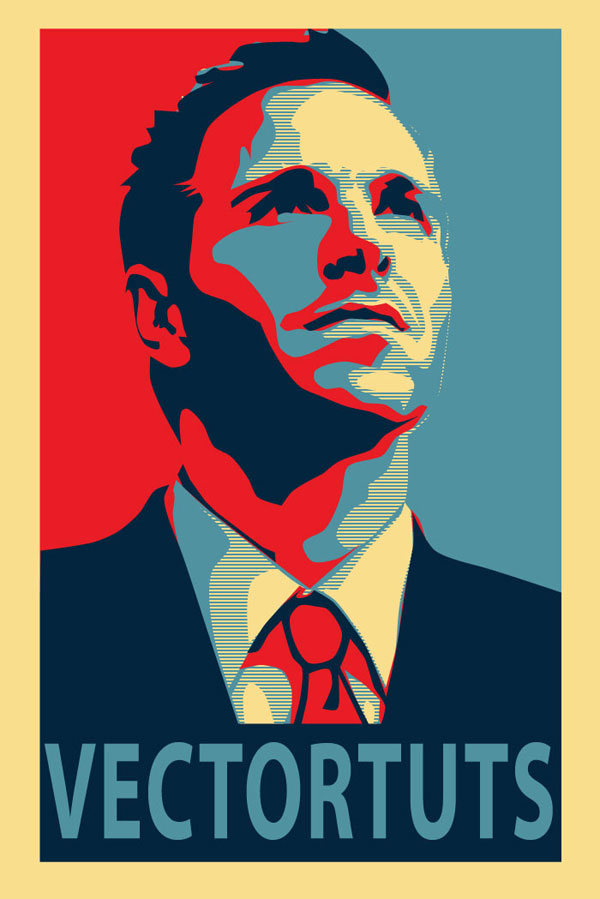
Learn how to create a Shepard Fairey Photoshop effect with the help of Illustrator with this poster tutorial.
This tutorial is inspired by Shepard Fairey's famous political poster series for the Obama Democratic Party campaign in the US in 2004 and now being recreated for the Time magazine cover for November 2020, month of the US Election.
We'll be showing you how to create this style of design. We'll start with basic image editing techniques in Adobe Photoshop to get our guide layers setup, and then we'll jump into Adobe Illustrator. You don't need any fancy equipment to do this. I used an older mouse that still has the rubber ball.
Note: This tutorial has been recently updated, however the stock image and pattern are no longer available for download. Please find the appropriate items to replace them to complete the exact end result. Envato Tuts+ does not endorse any political party in the publishing of this tutorial. Rather, this tutorial is focused on demonstrating a workflow for recreating this iconic poster.
Create the Hope Photo Effect in Seconds!
Want to save time and get a Photoshop action which will create the Hope photo effect in seconds? With this Obama Hope Poster Generator Photoshop Action from Envato Elements.

1. Crop and Modify Your Stock Image
Step 1
For this effect it is best to have a portrait style picture, preferably of a subject that appears to be thinking, or looking off into the distance.

Step 2
Once you have your image, you need to Open it in Photoshop and Crop it appropriately. The top of the image should be cropped to the top of your subject's head, and the bottom should be a bit higher than chest height. The crop should have about a 2:1 ratio.

Step 3
Now we need to Posterize the image. Go to Image > Adjustments > Posterize. An appropriate posterization level for the look we are going for is 5.

Step 4
Now we're going to create our guide layers for use in Illustrator. Start by duplicating your posterized layer, and name this new layer "Pattern Guide." Then go to Image > Adjustments > Threshold. We're going to slide our Point until we get something similar to below. We want it fairly dark, but still with a small amount of detail. Also, when using Threshold, it is best to use the Peaks that you see.

Step 5
Save this newly created layer as "patternguide.psd," or something similar, as you'll need it for Illustrator.

Step 6
We need to repeat Step 4 and Step 5 three more times. Each time apply a lower threshold, and save each new layer. Below are the settings I used, again notice the peaks.

2. Setup Your Document and Palettes
Step 1
Before we start to outline our layers, we need to create the horizontal blue line pattern. To do this create a new Illustrator document. Give it a Height and Width of 4px. Then create a rectangle filled with our light blue color (#4F919F), and cover the top half of the canvas.

Step 2
Cover the bottom half with a rectangle filled with beige. Then Select All (Control + A), and drag this over to our Swatches panel. Congratulations you've made a pattern!

Step 3
Now we have to save this Swatch set so we can use it in our poster we're about to make. In the bottom left corner of our Swatches panel we'll select Save Swatches from the Swatches Library Menu. Name it anything you want, I used "pattern." You can now close this document, as we won't need it anymore.

Step 4
Here is the color palette we'll be using for this tutorial. There are four colors and a pattern. We'll be using a mix of beige and light blue colors.

3. Create Your Portrait
Step 1
Now that we have our reference images and pattern created, it is time to create a New document in Illustrator. I used a canvas size of 700 x 850px.

Step 2
We're going to start with our darkest guide layer, this will be our pattern layer. We're going to outline the layer using the Pen Tool (P). So to start we're going to go to File > Place and select our first reference layer into Illustrator. If you've been following verbatim, this file to place is called "patternguide.psd".

Step 3
Let's stop for a moment and discuss the proper use of the Pen Tool (P) in Illustrator. This is one area where Illustrator handedly trumps Photoshop, but only if you use it correctly.
For any curve you basically have three clicks; two are anchor points, and the other is your curve point. You place your curve point at the highest point of your curve. You place the anchors at where the curve starts and ends.
One click is all that is needed when you are creating a curve. You can then change the curve points to curves after you have done the entire shape. To convert them use the Direct Selection Tool (A) and click on the Convert Selected Anchor Points to Smooth icon.

Step 4
Before we can outline our first layer, we need to load our pattern into the Swatches Library. To do this select Other Library from the Swatches Library menu in the Swatches panel.

Step 5
Okay, so back to outlining our first layer. Create New Layer below the file you just placed into Illustrator. This layer will hold our outline. We place it below because it is easier to see what we're outlining that way.
Now we grab our Pen Tool (P), give it a stroke of null, and a fill of our pattern. Then start outlining all the black areas with the Pen Tool (P). The key is to average it out, don't follow too closely to the guide layer. Just roughly outline, and don't worry about our curves, as we'll fix that after we create our outline.
Note: This is the most tedious part of the process.

Step 6
You might have noticed that there are portions in the middle that are lighter that we just went right over with outlines. Well we're going to fix that by outlining those using the same process. Fill those with our beige color, as shown below. We'll do this on a new layer just above the pattern layer. After you've done that, you should have something similar to the following.

Step 7
Now we smooth out the shapes we just created. We want most of our points to be smooth, but I find it looks better if you leave a few the way they are. View the effect below from smoothing both the pattern and beige layer.
Note: I made this image out of order and the pattern was wrong, don't worry about the color difference.

Step 8
Now we just do this same thing for each layer. Roughly outlining it, then outlining the highlights with the color immediately below it, and then smoothing out our outlines. The next layer should have solid light blue, followed by red, and then finally our dark blue.

Step 9
Okay, you should have something like the following. The tedious part is over. Now to make it look like a poster. First we'll put a beige filled rectangle below all these layers, this will serve as our background.

Step 10
Now we'll need to put our red and light blue halves in. We're going to do this just above the beige rectangle layer. Use the Rectangle Tool (M) to place the two rectangles.

Step 11
Our poster is looking pretty good. Let's create the space needed to add the inspiring text at the bottom. You'll probably have to enlarge your canvas area. To do this go to File > Document Setup. I added 300px onto mine.

Step 12
Now extend you beige rectangle so that it covers the new length of your canvas. Then create a new rectangle filled with our dark blue color. It should be a quarter the size of main subject.

Step 13
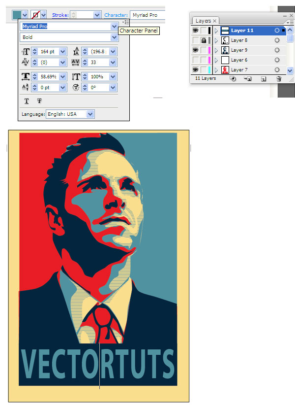
Time to add our inspiring word. We'll use light blue for the font color, and we want to change the text settings so that the word fills most of the dark blue rectangle. To change the spacing between the characters, use the Character panel. This is available to us when we are using the Text Tool (T). I used the font "Myriad Pro".

Step 14
Almost finished, we need to clean up our borders a little bit. First, select every layer, but your beige layer. Then create a Group (Control + G). Then Vertically and Horizontally Align them to the artboard.

Step 15
Now we're going to clean up the edges of our poster. Cover the layers that we grouped in a rectangle of any color. Then use the Pathfinder panel, and select Subtract Shape From Area.

Awesome Work! You're Now Finished!
Way to go, we're done! We managed to create a really awesome effect without needing a whole lot of artistic ability. We also learned how to efficiently use the Pen Tool, and a nice way to use Photoshop and Illustrator in tandem. This is my first tutorial, so I'm sure there will be questions. Feel free to ask in the comments, and I'll try and answer as quickly as I can. Thanks!

Want to Learn More?
Check out the following great poster design tutorials to learn more:
 Poster DesignHow to Create a Suffragette-Inspired Poster in Adobe InDesign #100Years
 RetroHow to Create a Vintage Soviet Space Travel Poster in Adobe InDesign
 SummerHow to Create an Ice-Cream Script Poster in Adobe InDesign
 InDesign TemplatesHow to Create a Memphis Style Club Poster in Adobe InDesign
 Poster DesignHow to Create a Chalkboard BBQ Poster in Adobe InDesign
 Poster DesignMovie Poster Design 101: The Anatomy of a Movie Poster
 Poster DesignHow to Create a Wanted Poster
No comments:
Post a Comment