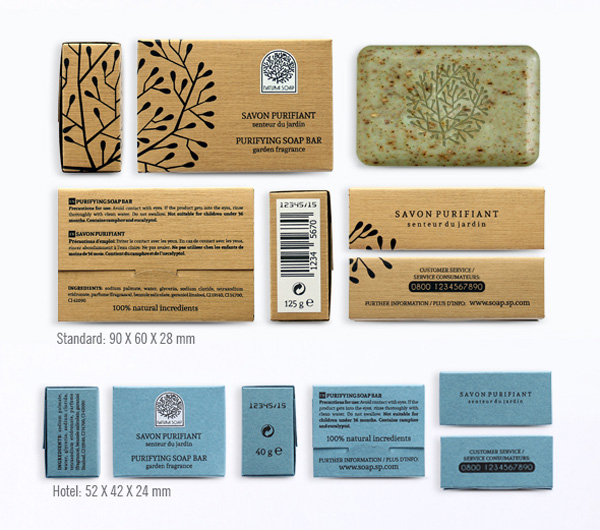
Designing packaging can seem daunting at first glance, but it needn’t be—some of the most effective designs are based on surprisingly simple templates.
Whether you’re looking for tips for creating cosmetics packaging, food cartons, bottle labels or origami-inspired boxes, you’ll be sure to find something here to inspire you.
Packaging takes 2D designs and transforms them into printed, tactile 3D creations—it’s an incredibly effective way of bringing a strong branded look to a product, or helping the consumer to commit to purchasing. In this article we’ll take a look at ten pro tips for giving your packaging a stylish, eye-catching look, as well as technical tips for choosing templates, software and print finishes.
Looking for the perfect packaging template? Take the time to browse the huge range of creative templates over on Envato Market.
1. Origami Styles Aren’t Only for the Brave
Sometimes you encounter packaging that’s so pretty it simply takes your breath away. Folded, origami-inspired designs look incredible and transform packaging into a work of art.
Many origami-inspired designs are surprisingly simple at their core, and are based on thoughtfully laid-out templates. With so many creative packaging templates at your fingertips through sites like Envato Market, these complex-looking designs are no longer out of reach.

The quirky packaging for these bath salts is tactile, portable and looks fantastic embellished with slices of citrus fruit.

If you’re brave enough to try creating your own origami designs from scratch, try experimenting with rough mock-ups on low-grade paper before you commit to the computer—it will help you to visualise how a 2D layout will translate to a 3D product.

Origami styles are not always the most practical or stackable of packaging designs, so they tend to suit display packaging best.
2. Simplify Packaging With Easy-Peasy Labels
At one end of the packaging spectrum is origami-style beauties, and at the other the refreshing simplicity of an easy-to-produce label.
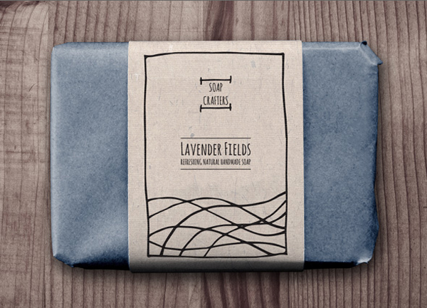
Labels can be attached to bottles, or wrapped loosely around tissue-wrapped items. They’re super-simple to design (no tricky folds to accommodate) and cheap to print, which is great if you’re on a tight budget.
This isn’t to say that labels lack impact—a well-designed label can bring a lovely hand-done look to packaging, as with these rustic soap wrap labels.

Labels are the perfect choice for independent shops and other small businesses looking to produce branded packaging quickly and cheaply, and they really can add to the charm of the product. Labels and simple stickers are also really practical—they’re easy to edit and can be resized quickly to suit various products.
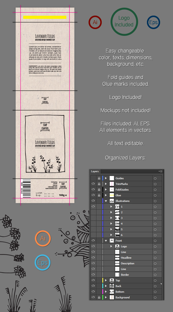
3. Let Your Typography Sell the Product
Typography is such a transformative element in graphic design—choose a classic serif and create an aspirational product, or go for a pared-back sans serif instead and you’re pitching a product that’s suddenly cool and trendy.
Packaging for wine and beer bottles provide some great examples of the power of typography to sell a product to a particular market.

You’ll notice that most champagne labels use traditional serif typefaces or heavily-tracked headers which communicate luxury and high-end quality.
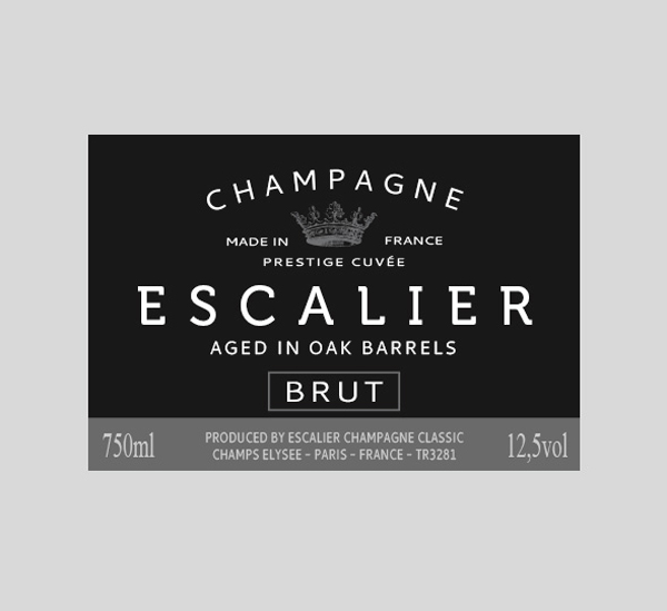
A lot of beer bottles feature informal sans serif or grunge typefaces, to emphasise the laid-back, relaxing nature of their products. Wine bottles can vary—an expensive wine might feature a classic serif to help justify the price tag, or a new wine on the block might use a modern slab type, as on this modern label template, to appeal to younger, fashion-conscious consumers.

When you design your packaging, try experimenting with a number of different type styles in your initial designs. Show the different designs to a market sample or friends/family—which type styles appealed to particular demographics? Does age, disposable income or lifestyle choice sway particular groups towards one typeface or another?
Once you’ve done your experiment, you’ll feel better prepared to use the type style that appeals best to your target market.
4. Use a Natural Color Palette
The days of bold, brash packaging have come to an end. To be relevant in the modern market, you need to tone it down.

Nature-inspired, tonal colors have a calming effect, and tap into the general trend for commercial products that are more eco- and ethic-conscious.
Try using tints of brighter colors to give a wash effect to packaging, or team colored elements with natural brown paper or card, as in this packaging design for natural soaps.

Even if your products aren’t 100% organic or don’t come fresh from the farmer’s market, you can still give a touch of wholesomeness to your packaging with a pared-back color palette.

5. Combine Photography With Minimal Styles
Packaging trends come and go, and one thing that is always in flux is the sort of graphics that feel appropriate. At the moment, illustrated graphics or simple typographic designs seem to be the most popular graphic media.
Photography may not be commonplace on packaging at the moment, but that’s not to say that it can’t look stylish and relevant if designed in the right way.

To keep photography on packaging looking slick and modern, stick to striking, graphic images, and consider using black-and-white photography. Teamed with colorful typography, this can look really eye-catching and on-trend.
Or take inspiration from these minimal templates for cosmetic products and team color photography with simple, sans serif type in a matching color.

Adding solid-color graphics set behind the white text keeps the design looking ultra-modern and app-like.

6. Go Arty!
Sure, a label might be small, but that doesn’t mean it can’t pack a punch. Labels are the perfect place to get really creative, and they're the stuff of dreams of many a graphic designer.
Many brands are exploring ways to make their products look unique, and some produce special-edition products to increase desirability amongst their loyal customers.
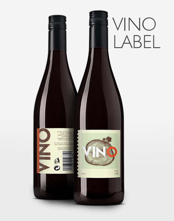
As a result, collaborations with artists are becoming more common in the packaging design world. Particularly for wine bottles, cosmetics and clothing, labels with an artistic touch help to define products as unique, aspirational and special.

If you don’t have Damien Hirst on speed-dial, you’ll have to put on your artistic hat. Painterly finishes, unusual type styles, and hand-drawn illustrations look incredible on packaging and will help your design to stand out from the crowd.

If you’re not a deft hand with a paintbrush, don’t fret—digital and vector art is equally desirable on modern packaging right now.

7. Go Masculine With Black and White...
Although it’s true that more retailers are pitching their products at a unisex market, there’s still a clear visual divide in products that are aimed at specifically men or women.
For products aimed at men, such as shaving products and men’s toiletries, there’s still a strict design code as to what sort of colors and type styles will convert to sales.
Though I wouldn’t condone the traditional blue for boys, pink for girls (that’s just lazy), you can add a masculine or unisex touch to your packaging designs with a strong, graphic black and white color combination. This modern packaging template does just that, and is visually very strong while communicating a masculine vibe.

Team your black-and-white designs with square sans-serif type for a modern take on traditional masculine packaging styles.

8. ...or Add a Feminine Touch With Pattern
A ‘feminine’ design doesn’t mean your product will only appeal to women—in fact, adding a feminine element to your packaging only means that you will bring particular qualities to the design, which often have broad market appeal, including elegance and beauty.
Adding a patterned design to your packaging is a fantastic way to bring a beautiful quality to your designs. Mid-century wallpaper-style designs add retro appeal to all sorts of products, or why not try an ornate, William Morris-inspired pattern, as in the packaging template below?

Patterned packaging is not only beautiful, but also a great way to create a uniform series of packaging designs.

These soaps may have different scents, but they are brought together into the same category or brand by simply switching up the color of the pattern, not by changing the design of the pattern itself.

Pattern is also surprisingly simple to design, thanks to its repetitive elements. Work on creating a single ‘unit’ of pattern, and then copy this repeatedly to create a whole sheet of pattern that can be pasted onto a packaging template easily.
9. Think About the Full Packaging Range
Your packaging designs don’t stop at just the box. Once a product is opened, you should consider how the style of the packaging can be extended to internal wrapping, labels, and sub-containers.
Designing a box for a clothes retailer? Once the customer opens up that box, how will the clothing inside be presented? Can you create a branded sticker to place on colored tissue paper? Can you design a stylish clothes tag to place on the garment inside?
This complete packaging range for tea bags is a great example of how to adapt packaging design to a range of purposes—a unified style, using colors, pattern and a strong logo, is extended across the main box to the tea bag packaging and label inside.

Keep in mind that packaging is not only for display purposes—to encourage a customer to repurchase, the whole experience of opening and engaging with the product needs to be as pleasurable as possible. A full range of packaging designs will help you to achieve this.

10. Turn Your Packaging Into a Walking Ad
Think about where you see packaging—on display in shop windows or on supermarket shelves are the obvious places. But you can think about extending your packaging ambitions even further and turn your designs into a mobile advertisement for the product or company.
Creating branded shopping bags is a great way of extending your advertising past the single customer interaction and bringing your brand to a much wider audience.

If your business is setting up shop at a conference or expo, this is a particularly effective way of advertising your stall around the convention hall. These modern branded bags are eye-catching and stylish, and certain to be both practical and a visual talking point for stall visitors.

If your budget won’t stretch to custom printed bags, why not design a simple sticker or stamp in the brand’s style that can be applied to a plain paper bag or canvas tote?
You’re Ready to Start Designing Awesome Packaging!
In this article, we’ve looked at ten tips for designing amazing packaging and labels. The next time you’re looking to tackle a packaging project, keep these ten useful tips in mind:
- Origami-style packaging doesn’t have to be complicated—with the help of templates and mock-ups, it’s surprisingly simple to create folded designs that look striking and decorative.
- Try out labels for a simple yet effective packaging design—wrapped around, tied to or stuck to boxes and bottles, labels can give a lovely hand-done look to your product.
- Let typography sell the product—switch up the style of your typefaces to transform the personality of your packaging and pitch it at particular consumers.
- Use a natural color palette—stay on trend with subtle tints and washed-out tones.
- Team photography with minimal design styles—keep photos looking modern and relevant by pairing them with ultra-modern sans serif type styles and tech-inspired graphics and colors.
- Go arty! Bring an artistic, unique touch to labels with hand-drawn or vectorized illustrations and logos.
- Add a masculine edge to packaging with a strong black-and-white color combination...
- ...or bring feminine flair with pattern, for a look that’s elegant and beautiful.
- Think about the full packaging range—extend your designs to stickers, labels and internal packaging for a truly immersive consumer experience.
- Turn your packaging into a walking ad—design custom shopping bags or add logos to totes for an easy way to advertise your business’s presence on the high street or at a convention.
Have any more top tips for designing your own packaging? We’d love to hear about them in the comments below.
If you’re still on the hunt for that elusive perfect label or box template, you’re in luck! You can find a whole range of great-value packaging templates on Envato Market. Or find even more packaging design tips in this article:

No comments:
Post a Comment