
In this Sketch tutorial you will learn how to design a car app UI.
To begin with you will learn how to create the starting components of any car app design. You will learn
- how to create a basic navigation bar,
- how to save and use symbols,
- how to incorporate images, icons and text in a car app
All these little features will ease your work throughout this iOS app.
- Using basic shapes, paths, and vector shape building techniques, you will learn how to create flat icons and buttons.
- Using subtle shading techniques and some text, you will learn how to make any car app design stand out.
- Finally, you’ll learn how to add a stock image to this iOS app.
For more inspiration on how to adjust or improve your final car app deisgn you can find plenty of resources at GraphicRiver.
What You Will Need:
You will need the following resources in order to design this car app. Most of these are available from Envato Elements, where a single subscription allows you unlimited downloads. You can also find alternatives to work with if you prefer:
1. How to Set Up the Artboard
Go to Insert > Artboard from the toolbar or menu (or press A) and the Inspector will reveal a list of artboard templates. Click the iPhone 11 template to create a 414 x 896 px artboard. Once you’re done, hit Escape to deselect your artboard. Now, let's start the work on this car app.

2. How to Add a Navigation Bar in a Car App Design
Step 1
Go to Insert > Shape > Rectangle from the toolbar or menu (or press R). Click and drag to create a 414 x 70 px shape, make sure that it stays selected and focus on the Inspector panel.
Use the X & Y input boxes to numerically place this new shape as shown in the following image. Enter 0 in the X box and 49 in the Y box and your shape will move to the top side of the artboard, as shown below.
Keep focusing on the Inspector panel, move to the Style section and simply disable the existing Border.

Step 2
Go to Insert > Shape > Oval from the toolbar or menu (or press O). Hold down the Shift key to create a perfect 12 px circle, make sure that it stays selected and focus on the Inspector panel.
Use the X & Y input boxes to numerically move your selection to the left side of that grey rectangle, as shown in the following image.
Keep focusing on the Inspector panel and move to the Style section. Disable the existing Border and change the Fill color to #2C2E43.

Step 3
Make sure that your circle is still selected and double click it to activate the Edit mode. Select the bottom point and double click it to turn it into a straight point, and then drag it 4 px down, as shown in the third image.

Step 4
Go to Insert > Shape > Oval (O), create a perfect 12 px circle and place it as shown in the first image.
Select this new shape along with the one lies in the back and click the Subtract button from your Toolbar.

Step 5
Focus on the right side of your grey rectangle. Go to Insert > Shape > Rectangle (R) and create a 12 x 2 px shape. Use the X and Y input boxes to numerically position this rectangle as shown in the following image.
Make sure that this shape stays selected and focus on the Style section from the Inspector panel. Disable the Border and change the Fill color to #2C2E43.

Step 6
Make sure that the tiny rectangle made in the previous step is still selected. Hold down the Option key and simply drag your selected shape to duplicate it. Hold down the Shift key while dragging the copy to constrain its movement to a single direction (horizontal or vertical). Drag the copy down and leave a 3 px gap between the two shapes. Repeat the same techniques with this newly added rectangle.

Step 7
Go to Insert > Text from the toolbar or menu (or press T). Click once on your artboard and focus on the Text section from the Inspector panel.
Select the San Francisco Compact Display font and be sure that the style is set to Regular. Set the size to 20 and the color to #2C2E43, change the text alignment to Center, and then type the "Available Car" piece of text. Place it as shown in the following image.

3. How to Add an Image in Your iOS App
Step 1
Download this Studio Photo Of An Orange Sedan In A White Background photo. Drag it inside your Sketch document, make sure that it stays selected and focus on the Inspector panel. Lower the Width to 350 px and use the X and Y input boxes to numerically position your photo as shown in the following image.
Feel free to replace the car image with a car wireframe, a sketch of car or another image and you may have. If you're interested in learning how to sketch a car this might help How to Draw a Car From Scratch.

Step 2
Go to Insert > Shape > Rectangle from the toolbar or menu (or press R). Create a 120 x 30 px shape and place it as shown in the following image (X:148 Y:256).
Keep focusing on the Inspector panel, drag the Radius slider to 15 and then move to the Style section. Disable the existing Border and remove it using that tiny trash icon, and then change the Fill color to #373737.

Step 3
Make sure that your rounded rectangle is still selected and keep focusing on the Style section from the Inspector panel.
Click that Shadows section to activate the shadow effect. Enter the numbers shown in the following image and then click the color well of this effect. Change the color to #373737 and lower the Alpha to 30.

Step 4
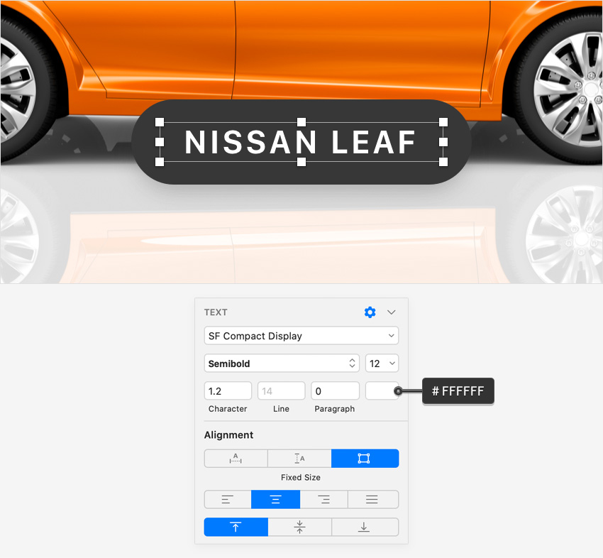
Go to Insert > Text (T), add the "NISSAN LEAF" piece of text and place it as shown in the following image.
Use the San Francisco Compact Display font and change its style to Semibold. Set the size to 12, the character spacing to 1.2 and the color to white (#FFFFFF) and make sure that the text alignment is still set to Center.
4. How to Add the Slide-Up Menu Box in a Car App Design
Step 1
Go to Insert > Shape > Rectangle (R), create a 414 x 555 px shape and place it as shown in the following image (X:0 Y:341).
Drag the Radius slider to 45 and then move to the Style section. Disable the existing Border and change the Fill color to #99EB99.

Step 2
Using the same tool, create a 50 x 3 px shape and place it as shown in the following image (X:182 Y:350).
Drag the Radius slider to 1.5 and then move to the Style section. Disable the existing Border and change the Fill color to white.

5. How to Save and Use a Symbol in a Car App Design
Step 1
Using the same tool, create a 120 x 50 px shape and place it as shown in the following image (X:20 Y:391).
Drag the Radius slider to 25 and move to the Style section. Disable the existing Border and change the Fill color to white.

Step 2
Using the same tool, create a 188 x 51 px shape and place it as shown in the following image (X:20 Y:391).
Drag the Radius slider to 25 and move to the Style section. Disable the existing Border and change the Fill color to #4CDC4C.

Step 3
Go to Insert > Text (T), add the "6TRJ244" piece of text and place it as shown in the following image.
Use the San Francisco Compact Display font and change its style to Light. Set the size to 18 and the color to white and make sure that the text alignment is still set to Center.

Step 4
Go to Insert > Text (T), add the "License Plate" piece of text and place it as shown in the following image.
Use the San Francisco Compact Display font and change its style to Thin. Set the size to 14 and the color to white #005000, and then switch the text alignment to Left.

Step 5
Select the two rectangles and the two pieces of text highlighted in the following image and click the Create Symbol button from the toolbar, or choose Layer > Create Symbol in the menu.
Name your symbol "Car Info" and click Create. This will create a master symbol separate from your artboard. If you make a change to a master this will also show in any instances of that symbol in your document.

Step 6
Go to View > Canvas > Show All Guides to enable the Smart Guides which will make it easier for you to align shapes in Sketch. Hold down the Option and the Shift keys, click inside your symbol instance and drag a copy below it. Leave a 20 px gap between the two symbol instances. This is where the Smart Guides will ease your work.
Select this newly added symbol instance and focus on the Symbol section from the Inspector panel. Editing those Overrides will change the content and the appearance of your selected symbol instance without affecting the master or the other instances. Type in "87%" in the top input box and "Charge Status" in the second input box. In the end your symbol instance should look like in the second image.

Step 7
Duplicate the symbol instance added in the previous step. Place the copy as shown below and edit the Overrides as shown in the following image.

Step 8
Go to Insert > Shape > Rectangle (R). Create a 414 x 1 px shape and place it as shown in the following image (X:0 Y:600).
Move to the Style section from the Inspector panel, disable the existing Border, change the Fill color to white and lower its Opacity to 30%.

Step 9
Go to Insert > Shape > Rectangle (R), create a 374 x 50 px shape and place it as shown in the following image (X:20 Y:621).
Drag the Radius slider to 25 and then move to the Style section. Disable the existing Border and change the Fill color to #24B424.

Step 10
Make sure that your green rounded rectangle is still selected and keep focusing on the Style section from the Inspector panel.
Click that Borders section to re-activate the border. Be sure that the Width is set to 1, change the alignment to Outside, and then click the color well of this border. Change the color to white and lower the Alpha to 30.

Step 11
Make sure that your green rounded rectangle is still selected and keep focusing on the Style section from the Inspector panel.
Click that Shadows section to activate the shadow effect. Enter the numbers shown in the following image and then click the color well of this effect. Change the color to #069606 and be sure that the Alpha is set to 100.

Step 12
Go to Insert > Shape > Rectangle (R), create a 100 x 40 px shape and place it as shown in the following image (X:289 Y:626).
Drag the Radius slider to 25 and then move to the Style section. Disable the existing Border and change the Fill color to white.

Step 13
Make sure that your white rounded rectangle is still selected and keep focusing on the Style section from the Inspector panel.
Activate the shadow effect, enter the numbers shown in the following image and then click the color well of this effect. Change the color to #006E00 and lower the Alpha to 50.

Step 14
Go to Insert > Text (T), add the "Card" piece of text and place it as shown in the following image.
Use the San Francisco Compact Display font and change its style to Light. Set the size to 16 and the color to #005000 and make sure that the text alignment is still set to Center.

Step 15
Go to Insert > Text (T), add the "Pay with" piece of text and place it as shown in the following image.
Use the San Francisco Compact Display font and change its style to Thin. Set the size to 14 and the color to white white and then switch the text alignment to Left.

Step 16
Select the two rectangles and the two pieces of text highlighted in the following image and click the Create Symbol button from the toolbar, or choose Layer > Create Symbol in the menu. Name this new symbol "Pay Info" and click Create.

Step 17
Duplicate the symbol instance added in the previous step. Place the copy as shown below and edit the Overrides as shown in the following image.

Step 18
Go to Insert > Text (T), add the piece of text shown below and place it as shown in the following image.
Use the San Francisco Compact Display font and change its style to Light. Set the size to 12 and the color to #006E00 and make sure that the text alignment is still set to Center.

6. How to Add Two Simple Buttons in Your Car App
Step 1
Go to Insert > Shape > Rectangle (R), create a 177 x 57 px shape and place it as shown in the following image (X:20 Y:799).
Drag the Radius slider to 28.5 and then move to the Style section. Disable the existing Border and change the Fill color to #004C28.

Step 2
Go to Insert > Text (T), add the "BOOK" piece of text and place it as shown in the following image.
Use the San Francisco Compact Display font and change its style to Semibold. Set the size to 20, the character spacing to 2 and the color to white and make sure that the text alignment is still set to Center.

Step 3
Duplicate that dark-green rounded rectangle. Select the copy, place it as shown in the following image (X:217 Y:799) and change the Fill color to #FAFF00.

Step 4
Duplicate that "BOOK" piece of text. Select the copy, replace the text with "UNLOCK", place it as shown in the following image and change the color to #004C28.

7. How to Add a Tiny Icon
Step 1
Go to Insert > Shape > Rectangle (R), create an 11 x 8 px shape and place it as shown in the following image (X:360 Y:826).
Drag the Radius slider to 2 and then move to the Style section. Disable the existing Border and change the Fill color to #004C28.

Step 2
Using the same tool, create a 7 x 8 px shape and place it as shown in the following image (X:362 Y:821).
Drag the Radius slider to 3 and then move to the Style section. Disable the existing Fill and focus on the Border. Set the Width to 2 and the text alignment to Inside, and then change the color to #004C28.

Step 3
Using the same tool, create a 1 x 2 px shape and place it as shown in the following image (X:365 Y:829).
Drag the Radius slider to 0.5 and then move to the Style section. Disable the existing Border and change the Fill color to #FAFF00.

Congratulations! Your Car App Design is Finished!
Here is how it should look. I hope you’ve enjoyed this iOS app and can apply these techniques in your future projects. Don’t hesitate to share your final result in the comments section.
Feel free to adjust the final car app and make it your own. You can find some great car app design inspiration at GraphicRiver, with interesting solutions to improve any car app design.

Want to Learn More?
We have loads of Sketch UI tutorials on Tuts+, beginner to intermediate level, take a look!
 SketchHow to Design a Fitness App UI in Sketch
 SketchHow to Design a Travel App Login Screen in Sketch
 SketchHow to Design a Money Management App UI in Sketch
 SketchQuick Tip: Recreate Apple Watch’s Activity Rings in Sketch
 TypographyHow to Create a Nautical Tattoo Font
 SketchHow to Create a Dynamic Icon Library With Sketch
 SketchHow to Use Sketch Symbols to Create Flow Diagrams
 SketchHow to Make User-Friendly and Reusable Sketch Files
 Responsive Web DesignTips and Tricks for a Responsive Design Process in Sketch
 SketchA Walkthrough of the Prototyping Tools in Sketch

No comments:
Post a Comment