
In this tutorial, we’ll be creating a hand-drawn lettering poster that will make our home cozy and add a warmer atmosphere to any interior. We’ll be using various drawing tools and functions of Adobe Photoshop to create fancy letters from scratch and digitize our handwriting, transferring it from paper into Photoshop and editing it to make it fit our poster.
But if you'd like to save some hours of work and find the best hand-lettering fonts for your digital projects, scroll down after this tutorial. We've got a selection of premium hand-lettering fonts from Envato Elements.

What You Will Learn in This Hand-Lettering Tutorial
- How to draw letters in Photoshop
- How to draw letters for a poster
- How to do hand-lettering quotes
- How to digitize hand lettering
Let’s get started!
1. How to Create Hand Lettering With the Pen Tool
Step 1
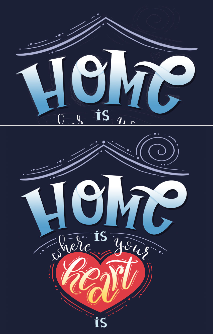
Everything starts from scratch. First of all, we need to have an idea of what we are going to create. As we’re planning to create a housewarming hand-lettering poster, I’ve decided to choose a nice quote for a cozy atmosphere. I’ve made a couple of rough thumbnail sketches, writing out "Home is where your heart is" and emphasizing the word "home".
On the first sketch, I’m trying to insert the quote inside a house shape, but in this case, I think the image looks somewhat cramped and busy with the unneeded details, while the main part of the composition—the lettering itself—is too monotonous. Apart from that, it doesn’t interact with the word "heart", which is another important and meaningful element of the whole phrase, balancing with the word "home".
Thinking this way, I make another rough sketch (even rougher than the first one, as you may notice), where I clearly emphasize both words. I also add a touch of symbolism, depicting a stylized roof on top of the word "home" and placing the word "heart" into a heart shape. Now everything looks more balanced and meaningful. Let’s make a poster from the second sketch!

If you want to use the same sketch as a reference image, you can right-click on the screenshot below and Save it to your computer.

Step 2
Let's continue with the hand-lettering practice. Create a 3000 x 3000 px, 300 ppi New Document and place your sketch there. We'll learn how to draw letters in Photoshop.
Use the Eyedropper Tool (I) to pick the dark-blue color from the sketch and apply it to the Background Layer using the Paint Bucket Tool (G).
Lower the Opacity of the Sketch to 25%, making it semi-transparent if it distracts you too much.

Step 3
Now let’s take the Pen Tool (P) and start outlining the letters of the word "home". Use the polyline to draw out the left stem of the letter "H". Close the path and move on to the right stem, making it thinner.

Not confident with the Pen Tool? Don’t worry, you just need a bit more practice! This tool is actually not so scary and difficult to use as it might seem! Check out these easy-to-follow instructions on using the Pen Tool and see for yourself!
 Pen ToolPhotoshop in 60 Seconds: Getting a Grip on the Pen Tool
 Tools & TipsPhotoshop's Pen Tool: The Comprehensive Guide
Step 4
Make a rectangular shape for the crossbar, and let’s unite all the elements of our letter! Select them all with the Direct Selection Tool (A) and head to the Path Operations menu in the control panel on top. From here, let's select Combine Shapes and apply it by choosing Merge Shape Components at the bottom of the menu. There we have it! Now all the parts of the letter are merged!

Step 5
Let’s move on and trace the letter "O". It will consist of several elements, so let’s start with its main part. Try to make the line smooth and curved by dragging the anchor handles every time you make a point. Make an oval and then another one for the counter of the "O".
Select both ovals with the Direct Selection Tool (A), and this time let’s Exclude Overlapping Shapes in the Path Operations menu. Click Merge Shape Components to cut out the inner circle.

Step 6
We can fill our letter with some color to see if the Path Operations work. Let’s open the Paths panel (Window > Path) and click Fill path with foreground color at the bottom of the panel, applying the Foreground Color which is currently set to white in our Color panel.

Step 7
Let’s Undo (Control-Alt-Z) our previous action to remove the fill and continue designing the letter.
Use the Pen Tool (P) to shape the swash of the letter "O", using the sketch as a base and tracing above it. Start from the top left part of the letter "O" and gradually move to the right, making a banana-shaped curve.

Step 8
Remember that you can change the direction of the path without releasing the mouse key (or the pen of your graphic tablet) and without switching between the tools. Simply click and drag to make the handles of the anchor point visible. Then, holding down the mouse button, click Alt, rotate and move the handle up. Close the path, connecting it with the very first anchor point of the swash.
We can always use the Direct Selection Tool (A) to move the anchor points, making the lines look smooth.

Step 9
Let’s select both elements of the "O" and use the Combine Shapes and Merge Shape Components functions to unite the shapes.

Step 10
Let’s move on and use the Pen Tool (P) to draw out the letter "M" with the polyline.

Step 11
Continue to the letter "E"'; this one will be a bit more complex than the previous letters. Start making an elliptical shape with the Pen Tool (P), similar to what we did with the letter "O". Use straight lines to form the finial of the letter, and then continue forming a curved path for the inner part of the "E".

Step 12
Gradually move up. Hold down Alt to change the direction of the anchor handle to make a corner at the crossbar of the letter "E". Finish off its silhouette, closing the path.

Step 13
Add a drop-like shape for the inner part (the counter) of the letter. Now we can select both elements and apply Exclude Overlapping Shapes (don’t forget to Merge Shape Components after selecting the desired function in the Path Operations).
We can check our letter in the Paths panel by filling it with white.

Step 14
Now let’s add a swash to the opposite side of the crossbar, using the Pen Tool (P) to form a curved shape.

Step 15
Select both parts and Combine Shapes in the Path Operations, clicking Merge Shape Components to apply the effect.

Step 16
Great! All the letters of the word "home" are ready. Let’s take a look at them and use the Paths panel to fill the letters with white.
Now let’s make the letters look more interesting and diverse by applying some effects to the fill.

2. How to Add Shadows and Gradients
Step 1
The next steps in our hand-lettering practice are shadows and gradients. Let’s add some volume to our letters using a gradient fill. Take the Gradient Tool (G) (you can find it in the same drop-down menu as the Paint Bucket Tool).
First of all, head to the Layers panel and Lock transparent pixels of our "home" layer so that everything we do is applied only to our letters, without affecting the area around them.
Go to the Color panel and set blue for the foreground color and white for the background color.
Then grab the Gradient Tool (G) and drag from the bottom to the top of the word "home", applying a vertical linear gradient from blue to white. You can check the gradient settings in the control panel on top, selecting the desired type of gradient.

Step 2
To make the word "home" stand out a bit more, let’s create a shadow cast on the background by the letters. Create a New Layer right under the "home" layer. Now, keeping the new layer selected, hold down the Control key and click the "home" layer. This way we create a "marching ants" selection around the letters.
Set the foreground color to dark blue in the Color panel, take the Paint Bucket Tool (G) and click to fill, creating a dark-blue copy of the word "home" on a new layer. Now we can move the bottom layer a few pixels down and to the right, making the dark-blue shadow visible.

Step 3
Now let’s see how we can add gentle shadows to the letters, making them more three-dimensional. We'll be using the Pen Tool (P) or the Freeform Pen Tool to create the shape. Let’s Zoom In (Control-+) on the letter "e" and draw a path connecting its swash with its crossbar, as shown in the screenshot below.
Continue building the path, making a rectangular shape. It doesn’t have to be perfect—just make sure that it is wider than the letter.

Step 4
Select the "home" layer in the Layers panel, hold down Alt, and click the Create New Layer button. In the pop-up New Layer window, tick the Use Previous Layer to Create Clipping Mask box to create a linked layer. You will see a small arrow next to our new layer, indicating that anything we draw on it will appear only inside the boundaries of the objects on the main layer.
Let’s see how it works. Right-click and Make Selection. Use the Gradient Tool to apply a diagonal linear gradient from blue to white.

Step 5
Switch the Blending Mode of the linked layer to Multiply, making the white part of the gradient transparent. This way we’ve created a gentle shadow, separating the crossbar (and its swash) from the body of the letter "e".
Add a similar shadow on top of the crossbar, this time changing the direction of the gradient to the opposite.

Step 6
Use the same technique to add a shadow to the letter "o", separating its curled swash from the bowl of the letter.
Now the whole word looks three-dimensional and finished! Let’s move on to the next element of the composition!

3. How to Digitize Hand-Lettering Posters
Step 1
In this next stage of learning how to digitize hand lettering, we'll add some custom shapes. What we’re going to do next is to add a heart shape. Luckily, we don’t need to draw it manually, as we can take the Custom Shape Tool, pick a heart from the list of Shapes in the control panel on top, and create a heart of the desired size, using our sketch as a reference.

Step 2
Take the Direct Selection Tool (A) and move the anchor handles, making the heart more bulging and rounded at the bottom. If you can’t see the handles, use the Convert Point Tool to click and drag the handles out of the anchor point.
We can switch between Fill and Stroke color (or apply both, or set both to none) from the control panel on top, selecting the desired color from the drop-down panel.
I’m setting the Fill color to None for now as I need to see the letters of my sketch inside the heart.

Step 3
Let’s move on to the word "heart". For such script-style hand-drawn lettering, I actually prefer to use a real brush pen and paper. If you’ve always wanted to try hand lettering, this is a good starting point. One of the best brush pens to start with is Tombow Fudenosuke, or it can be any other brush pen of your choice.
You can also do it just with a usual gel pen or even a pencil, creating a so-called "fake calligraphy", drawing those thicker downstrokes manually and filling them with color. In our case, it doesn’t matter how you reach this hand-lettered effect as long as it looks good, as we’re going to tweak it in Photoshop anyway.
So I just draw out my letters on a piece of paper, positioning the letters in such a way that the composition resembles the shape of a heart. We can tweak the position of each letter later on if it doesn’t fit our heart, so don’t worry about it, but still try to make it look close to those letters we have in our reference sketch.
Scan your lettering (or make a photo) and drag it into Photoshop. Go to Image > Adjustments > Levels (Control-L) and from here we need to increase the overall contrast and brightness of our lettering layer to make the dark letters really black and the background color white, making the paper texture disappear.
To do this, drag the black slider to the right and the opposite (white) slider to the left, placing them closer to the middle slider. You will see the difference while adjusting the position of both sliders, making the image look sharp and clean.

Step 4
Once you’re satisfied with your contrast lettering, go to Select > Color Range to open the options window. From here, you’ll have the Eyedropper Tool selected by default. Use it to hover over the word "heart" and click any of the black letters. Leave the Fuzziness slider at 40% or adjust the value if you feel that not all the black area is visible in the preview. Click OK once you’re ready and you’ll see a "marching ants" selection around the letters. Copy (Control-C) the letters.

Step 5
Now we can Paste (Control-V) the "heart" word into our poster and press Control-T for Free Transform to resize and rotate the layer, making it fit the heart shape.
If some of the letters don’t fit the heart shape, use the Lasso Tool (L) to select the letter (just draw around it), and then hit Control-T again and rotate/resize the selected letter individually.
Let’s make our letters visible and bright. Select the "heart" layer and go to Image > Adjustment > Invert, changing the color of the letters from black to white.

Step 6
Let’s add some smaller details around the letters. Take the Brush Tool (B) and either open the Brush panel (Window > Brush) or right-click to open the list of brushes and select a Hard Round Brush.
If you don’t see any of these on your list, open a drop-down menu by clicking the small cog icon in the top right corner and find Round Brushes with Size on the list. Click it and either replace or Append it to your brushes list.

Step 7
You can find the brush settings in the control panel on top. I keep both Opacity and Flow at 100%, making the lines sharp and thick. I’m drawing dots and strokes around the letter "h", using the graphics tablet.

Step 8
Go on adding strokes and dots around each letter. Once you’ve finished and are happy with the result, select the heart shape layer, click the Custom Shape Tool to make the Shape menu in the control panel on top active, and set the Fill color to red, filling the inner part of the heart.

Step 9
Let’s give our "heart" lettering more of a golden or metallic look by applying a simple linear gradient from yellow to white. This way it looks more three-dimensional.

Step 10
Next, we’re going to draw the word "is", which is used twice in our quote. So you can actually write it twice to make every element look unique and hand-written, or go on and just duplicate the one you make.
I’m using the same Hard Round Brush and my graphic tablet here to draw the small letter "i", using the sketch as a reference. As you can see, I draw the top and bottom horizontal lines in the first place, and then I add two vertical lines for the edges of the letter, defining its thickness. And finally, I just fill the inner part of the letter with light-blue, almost white, color.
Then I use exactly the same technique for the letter "s": I draw out its silhouette and then I fill its inner part with color.

Step 11
Here we can see how our poster looks so far. I’ve used the copy of the "is" layer (Control-J) to add it right under the heart.

Step 12
Now we can move on to the next element of our composition and add the "where your" words right above the heart shape.
You can experiment with the Hard Round Brushes or Calligraphic Brushes of Adobe Photoshop to achieve a hand-written effect if you have a firm hand and a graphics tablet. Or you can follow the same technique as we used for the word "heart".
So let's write out the phrase "where your" on paper using the brush pen, and then scan it and bring it into Photoshop to make it clean and contrasting using Levels (Control-L). Next, use Select > Color Range to select the black letters, Copy (Control-C) them, and Paste (Control-V) right into the poster. Use Free Transform (Control-T) to rotate and resize the words, making them fit the top part of the heart shape.
Don’t forget to Image > Adjustment > Invert the layer to make the letters white.
As you can see from the screenshot below, I’ve also started adding red dots and strokes along the left edge of the heart in the same way as we did for the word "heart". It gives an intricate and playful look to the overall design of our poster, so let’s stick to it, adding more ornamental details of this kind.

Step 13
Continue adding those minor decorative details around the heart, using the Hard Round Brush with 100% Opacity and Flow.

Step 14
As soon as we’ve finished the heart, let’s move to the top of our poster and draw a stylized roof of our house in the same ornamental style. Make a New Layer, set the foreground color to light blue, and vary the size of the brush, making the triangular base of the roof a bit thicker than those dots and strokes around it.
I’m adding a swirling element by the right side of the roof, depicting some very simplified, almost abstract smoke from the fireplace chimney.
Next, I’m adding some strokes beneath the word "home", bending them in the opposite direction to balance the roof.
Step 15
Let’s move on and create a New Layer for another set of decorative elements. Here I’m making the foreground color much, much darker and adding swirls, strokes, and dots around the letters of the word "home". You can Image > Adjustment > Invert the layer if the strokes are too dark to work with and then Invert back when you’ve finished with the whole word.

Step 16
Our dark ornaments here are finished! Let’s continue!

Step 17
We’ll be adding some more swirls and strokes around the heart. Start by filling the left side of the image and then move to the opposite side, creating similar ornaments to make the composition look balanced.
Finish up by adding light-blue horizontal strokes on both sides of the word "is" at the very bottom of the poster.

Home Sweet Home! Our Hand-Lettering Poster Is Ready!
Great job, folks! I hope this tutorial will inspire you to create more hand-lettered playful posters for your cozy interior or for print. Feel free to use all the tips and tricks described in this article, and don’t forget to share your result.
Happy designing!

5 Top Hand-Lettering Fonts From Envato Elements
In this hand-lettering practice tutorial, you've learned how to draw letters for a poster. Next up, let's check out some of the best hand-lettering fonts from Envato Elements.
If you're a digital creator, you'll love our subscription-based marketplace. For a low monthly fee, enjoy unlimited downloads of the best hand-lettering fonts. You can also get unlimited premium fonts, graphic templates, actions and presets, and more.
Let's review some awesome hand-lettering styles from Envato Elements:
1. Backabon Hand Lettering Font (OTF, TTF, WOFF)

Backabon is a nice hand-lettering font with a classic look. This hand-lettering design features a script font and is great for logos, quotes, and any creative project.
Try this hand-lettering kit with web fonts and PUA-encoded characters.
2. Gorden: A Hand Style Font (OTF, TTF)

You know there are many hand-lettering styles out there. Why don't you try this unique font for hand-lettering quotes?
Gorden is a hand-lettering kit with four different styles! You'll get alternate, line, and line alternate hand-lettering designs. Try it today!
3. Steelmond: Hand Lettering Font (OTF, TTF)

There are many hand-lettering styles. This one is inspired by brush pen hand lettering. Use this cool hand-lettering design for logos, clothing, hand-lettering quotes, or any other project!
4. Monstalk: Hand Lettering Vintage Serif Font (OTF, TTF, WOFF)

Looking for vintage hand-lettering styles? This vintage display serif font is for you. This type of hand-lettering font looks great on posters and branding.
Try this complete hand-lettering kit with web fonts today!
5. Rosemary: Hand Lettering Serif Font (OTF, TTF, WOFF)

If you're looking for a hand-lettering kit for your next business logo, Rosemary is for you. This elegant hand-lettering design looks particularly great on branding projects.
Hand-lettering styles like this feature a serif font with a handmade feel, perfect for creative designs.
Explore More Cool Hand-Lettering Fonts and Resources
I hope you liked this hand-lettering practice and the selection of the best hand-lettering fonts. Now you're an expert on how to draw letters for a poster.
If you'd like to explore more awesome hand-lettering fonts and tutorials, check out these resources:
 Hand LetteringNew Course: Hand Lettering for Beginners
 Hand LetteringHand Lettering: Letterforms at Their Core
 Hand LetteringHand Lettering: Scripts, Swirls, & Flourishes
 Fonts25+ Best Free Hand-Lettering Style Fonts (Designs for 2021)
 Fonts35 Best Calligraphy Fonts
 Fonts29 Best Handwritten Fonts
 Digital PaintingHow to Create a Textured, Hand-Lettered Card in Adobe Photoshop
 Hand LetteringHow to Create a Hand-Lettered T-Shirt Design in Adobe Illustrator

No comments:
Post a Comment