
Alright everyone! We've made it to the end of the series. Hopefully you've learned a lot in this hand-lettering journey. In this tutorial, you will use everything you've learned across the previous tutorials and apply that to a finished piece. This means we will take our lettering from an idea to a sketch, to vector, detailing, and beyond.

Here you'll learn how to do hand lettering from start to finish. But if you'd like to find the best hand-lettering fonts for your digital projects, scroll down after this tutorial. We've got a selection of premium hand-lettering script fonts from Envato Elements.
What You Will Learn in This Hand-Lettering Tutorial
- How to sketch a hand-lettering design
- How to digitize hand lettering
Feel free to follow along with the steps below, or devise your own game plan. Either way, you'll have a finished and polished piece of lettering at the end. Let's start this hand-lettering practice!
1. Preparing the Tools You Need
- Adobe Illustrator
- Pen or pencil for drawing
- Tracing paper
- Optional: Tombow brush pen, pilot parallel pen, Copic marker, Sharpie, or other tools
The optional tools will allow you to develop the weight/contrast in your letterforms. It all depends on the style you're going for. Use your best judgement when picking a tool for the right styling of letters.
2. How to Sketch a Hand-Lettering Design
Step 1
Every project (unless directed by a client of course) starts out with creating/forming your own phrases to write! Begin by making a list of phrases and select whichever phrase you'd like to move forward with throughout this tutorial.
My list is below. I selected the phrase "Comparison Kills" because it's something that is meaningful to me at this particular point in my life. I find if you begin to draw things that actually mean something to you in some way, the outcome is significantly better.

Step 2
The next step after selecting your phrase is to begin cranking out some fast and dirty sketches! Draw as quickly as you can, and use as many variations as you can. Alter the baseline, change the shape, try various lettering styles, etc.
As you can see below, I began to experiment with some blackletter forms. I wanted to challenge myself this time around because I rarely attempt blackletter. It's rather difficult! But I was determined to make it work.

Step 3
After you've sketched enough, select one composition that you think is working best to move forward with. For me, it was the comp in the bottom right corner of the page of sketches I completed.
Use that sketch as the "skeleton" or basic structure. Place a piece of tracing paper on top of your skeleton and begin to add your styling, contrast, width, etc., with whatever tool you please. Whether that's a Tombow brush pen, Copic marker or sharpie, it's up to you!
For this piece of lettering below, I felt the Pilot Parallel Pen was the perfect choice for blackletter forms.

Step 4
Moving forward, it's time to make all the necessary corrections. Place another piece of tracing paper on top of your lettering to begin fixing the kerning, baseline, letterform widths, overall color, etc.
At this point, I was attempting to fill in the negative space towards the bottom right of my composition with an illustration. Since the word "Comparison" is so lengthy compared to the word "Kills", it felt a little off balance to me. You may notice I also made small corrections to the capital "C" and added an extra flourish from the leg of the "K".

Step 5
Just as I was attempting in the previous step, I continued to experiment with various ways to fill that negative space in the bottom right. This sketch is a little crazy, but it was necessary to understand what worked and what didn't.
At this point, continue to make those edits to your composition to perfect your lettering. In this particular sketch I noticed my baseline was all over the place! In the next few steps, I make slight adjustments to make it a little more even.

Step 6
Once you get your lettering to a decent place with the tools you're using, it's time to move on to pencil. The tools are great to provide you with consistent weights and angles within your letterforms, but the pencil allows you to make those fine adjustments to really bring the lettering home.
Once again, trace your lettering, making optical corrections, but this time trace it using a pencil to perfect the tiny details.

Step 7
Keep progressing with those pencil sketches by tracing over your previous piece. Each time you draw and redraw your piece of lettering, it will take on a much cleaner and more refined look.
As you can see below, I'm still attempting to fill that awkward negative space next to the word "Kills". It's a little troublesome, but in the next step you can see how I ended up fixing that issue.

Step 8
The pencil sketch is nearing completion! I finally decided to add in an illustration of a coffin to be a little more literal with the word "Kills". Remember, if you decide to incorporate illustrations into your lettering, make sure they work alongside the lettering. You want your illustration and lettering to go together and play off each other, rather than feeling like two separate entities.
Also, you may notice that at this stage I was experimenting with drips extending from the lettering to add a bit of style to the piece. It's an extra touch that makes the lettering more interesting/engaging in my opinion.

Step 9
I've finally come to the end of the pencil sketches. The finished pencil sketch is complete, and now it's time to take it further in Adobe Illustrator. There are still minor corrections to make on this piece, but I felt I could take care of those edits in the "vectoring stage" of the process.
Once you've reached this point, scan your lettering onto your computer and prepare to vector on top of it within Illustrator.

Here's a process GIF that shows the evolution of the pencil sketches. It's crazy to see how horrible the first sketch was, but it has evolved into something much greater. The process is the best part!

3. How to Digitize Hand Lettering
Now it's time for my favorite aspect of the hand-lettering process, vectoring! Figuring out how to digitize hand lettering varies depending on the project. It's going to be rather difficult vectoring some blackletter forms, but that's alright! It will just require a little bit of extra time to get things looking right. Let's begin!
Step 1
For me, it's easiest to begin by outlining your sketch using the Pen Tool. We are essentially working with only strokes at this point. Start left to right and work your way around each individual letterform, outlining as you go. It helps to create individual shapes for letters such as the "i" or the "m". That way, you can go back and edit the pieces while they're still separated, instead of altering an entire letter.
Below is a really rough quick pass around the letters. This was done just to lay down the initial anchor points, which we will later tweak and edit further.
Step 2
Next, we're going to begin to invert those strokes into solid shapes. Once you fill in your letterforms, you'll notice lots of changes you probably need to make, such as correcting the weights, contrast, widths, etc., once again.
You know the drill! Begin wherever you see fit to perfect your lettering until completion.

Step 3
I've begun to make all of the weights consistent and corrected a lot of the contrast issues as well. I even rounded a lot of the edges of the letterforms so they wouldn't feel so harsh.
If need be, begin to make further edits to really drive your lettering home. At this stage, I'm feeling it's at the right spot to continue to add some stylization to the lettering. In this case, I'm going to bring back some of the "drips" I drew in my initial pencil sketches.

You can see below how I incorporated the drips within the lettering. I drew all of the drips separately with the Pen Tool and placed them on top of the lettering. This way, if changes are needed to the drips, you won't have to edit the letterforms as well.


Step 4
To take the dripping effect to the next level, I drew various additional drip-like shapes with the Pen Tool and placed them all over the lettering. It may be rather difficult to see in the below image, but you can see the effect we're going for in the "What You'll Be Creating" image at the top of this tutorial.
To develop the secondary drips, it's essentially the same process as above, although these are strokes instead of shapes. Use one darker-valued stroke for the "shadow" of the drip and a couple of lighter-valued strokes for the "reflection". There's a close-up image of the drips towards the end of this tutorial as well.
Again, I drew these drips separately and laid them on top of the lettering afterward.


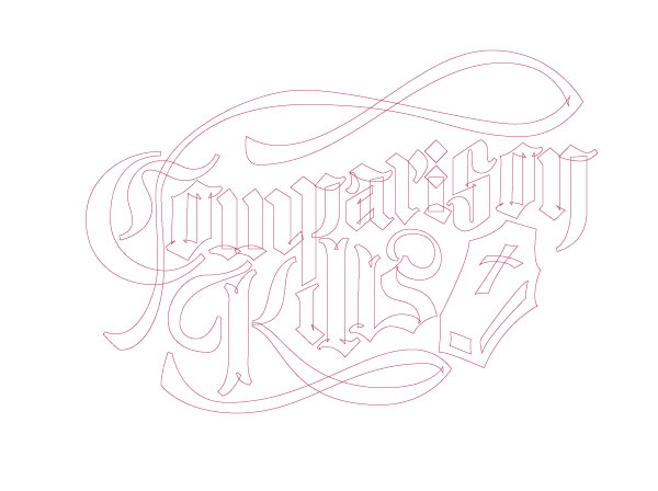
Step 5
After all of that is completed, you now have the option to change hues, values, etc. to your liking! The below image is the final piece after all of the steps are completed. It sure was a lengthy process, but certainly worth it I hope!


As always, here is the process GIF of the vectoring stage to show the steps taken to reach the final piece of lettering. The smallest changes make all the difference!

5 Top Hand Lettering Fonts From Envato Elements
Now you know how to do hand lettering from start to finish in this hand lettering practice tutorial. Next up, let's check out some of the best hand lettering fonts from Envato Elements.
If you're a digital creator, you'll love our subscription-based marketplace. For a low monthly fee, enjoy unlimited downloads of the best hand-lettering fonts. You can also get unlimited premium fonts, graphic templates, actions and presets, and more.
Let's review some awesome hand-lettering script fonts from Envato Elements:
1. Devilion Hand Lettering Script (OTF, TTF, WOFF)

Devilion is a classic hand-lettering script font. What makes it unique are its cool alternates, ligatures, and swashes.
This easy hand-lettering font includes PUA-encoded characters and multilingual support. Use this hand-lettering alphabet for branding projects and more!
2. Santoy Hand Lettering Font (OTF, TTF)

Santoy is a relaxed and elegant hand-lettering script. It features a beautiful open calligraphy style. This hand lettering alphabet also includes glyphs, alternates, and ligatures, along with PUA-encoded characters.
3. Sienna Hand Lettering Script (OTF, TTF, WOFF)

If you're looking for a classic hand lettering alphabet, Sienna is for you. This vintage hand lettering design is perfect for stationery, branding, editorial design, and more. It comes with standard characters, punctuation, and tons of glyphs.
4. Cherrys Hand Lettering Font (OTF, TTF, WOFF)

This calligraphy hand lettering font is perfect if you're looking for a handcrafted look. Cherrys is great for signatures, quotes, book covers, or any other creative project. The hand lettering alphabet comes with ligatures and multilingual support. It's easy to install and use.
5. Inspiration Hand-Drawn Font (OTF, TTF, WOFF)

Do you like unique hand lettering designs? Try this one. The Inspiration hand-lettering script is a modern font that will give your designs a unique look.
If you need easy hand-lettering fonts, this is for you. This calligraphy hand-lettering font is easy to install and works on all common software.
Discover More Awesome Hand-Lettering Fonts and Resources
I hope you've enjoyed this hand-lettering practice and the selection of the best calligraphy hand-lettering fonts.
If you're hungry for more awesome hand-lettering script fonts and more, check out these resources:
 Hand LetteringNew Course: Hand Lettering for Beginners
 TypographyThe Difference Between Typography & Hand Lettering: Typography in 60 Seconds
 Hand LetteringHand Lettering: Scripts, Swirls, & Flourishes
 Hand LetteringHand Lettering: How to Vector Your Letterforms
 Fonts25+ Best Free Hand-Lettering Style Fonts (Designs for 2021)
 Fonts29 Best Handwritten Fonts
 Hand LetteringHow to Create a Hand-Lettered T-Shirt Design in Adobe Illustrator
 Fonts35 Best Calligraphy Fonts
 FontsHow to Choose the Best Wedding Fonts for Invitations and More
 TypographyMastering Calligraphy: How to Write in Roundhand Script
Conclusion
Well, this is the end, everyone. You've learned how to do hand lettering from start to finish and how to digitize hand lettering. Thanks so much for following along and reading the various tutorials I've shared with you. I just want to share what I've learned along my journey and hope it helps you out in some small or large way!

No comments:
Post a Comment